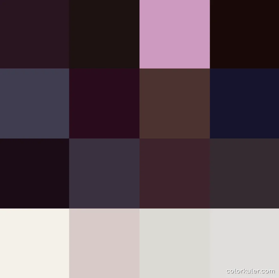
If you select the basic color of each photo in your Instagram account and collect these colors in a table, you will receive a color scheme of your profile. This scheme determines the nature of your account and forms its integrity.
If there are many different colors in the color scheme, the photos seem chaotic, especially when viewed on a phone in “tile” view mode. A chaotic color profile will have contrasting colors and will look like this:

If the profile has a more calm or peaceful color scheme, then it looks more confident, even, stylish and appealingly aesthetic. Here is an example of an account with a calm color scheme. Notice that all the colors are of one shade:

Here is the account of a popular brand @commedesgarcons. The color scheme in this account is all in one shade.

To check the color profile of your account, use the free service at colorkuler.com. Simply enter the name of your profile, and the service will show you your color scheme based on the latest photos you uploaded. Note that this works only with open profiles.

If your color profile does not seem to be balanced enough, correct it.
- Schedule photos that have just one shade, using Onlypult.
- Avoid bright shots, do not alternate between contrasting photos such as green and red or yellow and blue.
- Reduce the brightness and saturation of pictures before publishing.
- Use a filter in Instagram or use a photo processing program to achieve this.


