The first step in social media design involves uploading relevant and high-quality images to the network in the correct format. However, you’ve probably noticed that the quality and size of images displayed on social networks can vary significantly. When the Twitter banner dimensions of content are incorrect, the quality deteriorates, and photos get cropped.
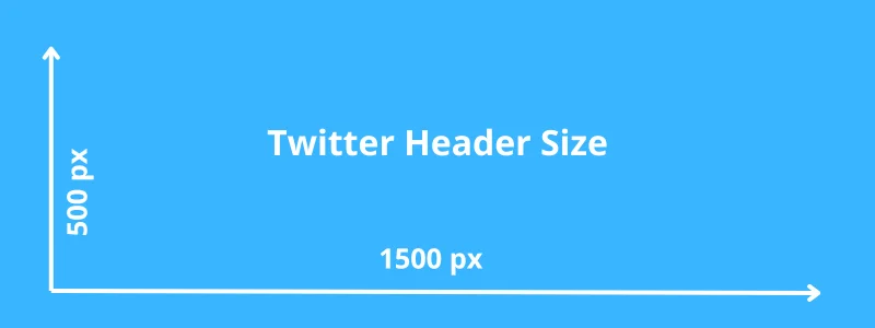
This is why you should always upload pictures in the correct dimension for the social network in question. For example, the ideal measurement for a Twitter banner (the long image that the user sees at the top of your profile) is 1500×500 px, no more, no less.
Yet, there is a complication here as well. The position and proportion in which your cover picture is displayed can vary depending on the device from which you access your page. Therefore, it is important to “calibrate” your Twitter header size properly, respecting the recommended proportions. This rule applies to all images - both the banner at the top and the profile picture. Let’s explore this topic and talk about Twitter images in more detail. This article will guide you about Twitter background image size and twitter header image dimensions with cover twitter photo size for grabbing attention of the users.
Key takeaways
|
Twitter Banner Dimensions 2024
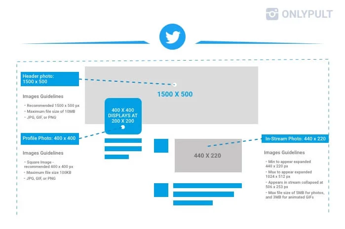
It is important to consider Twitter picture size when working with Twitter because images smaller than the recommended measurement will be stretched and become fuzzy. Don’t forget Twitter profile picture size. Pictures uploaded in a larger dimension can be compressed by the software and lose quality when compared to the original. As a result, if an image deviates from recommendations, it may be cropped in the wrong place.
So, the recommended Twitter photo dimensions of a cover (also known as profile or header images or banner) are 1500×500 px with a 3:1 Twitter banner aspect ratio. If your image doesn’t match these dimensions, you can easily adjust it using a photo editor. Photos or images used for the cover can be uploaded in any of the following formats: JPG, GIF, or PNG. The network does not support animated GIFs as profile or cover images. Maximum file size should be under 2MB.
There are no dynamic images on Twitter, so don’t try to put a GIF image in the banner. It will just freeze and look terrible. In addition, the automated system trims the photo to fit the format. So if your picture is too big, it will be cropped - and there are no guarantees that the outcome of this will be attractive.
With low-quality pictures, it’s the opposite - banners smaller than 48kb are not suitable. They will either be stretched so that every pixel is visible or will not be uploaded to the social network at all.
What Is the Best Twitter Banner Size?
Twitter banners is the acquaitance with the brand. It is important for image to be sharp and clear and also to look good on most mobile devices.
The best Twitter cover size and right twitter banner size are 1500 x 500 px. The acceptable formats are JPG, GIF and PNG. However, do not be afraid of making the image of bigger size. Twitter profile photo and banner image file sizes should be under 2MB.
When making the desing you should follow the recommendation of aspect ration of 3:1 — for example, 2400 x 800 px. Also it is important for you to take into account that the size should not be bigger then 5 mb. Moreover, the image will be partially covered by profile.
How to resize your Twitter header photo
After preparing the image for the profile cover open profile settings section «Appearance».
Click on «Change banner» button to upload a new image. You can change size in edit window. Enter header photos recommended dimensions (1500 x 500 px) and save changes.
After changing size you will see image preview. Make sure it displays correctly and save changes. Go to your profile page and reload it. Upper banner will be displayed with the new size.
Examples of Twitter Headers We Love
If you’re just starting out with Twitter, all these rules may sound a little intimidating. But fear not! With our simple, practical, and straightforward instructions, you’ll easily make your page stand out from the rest.
Example
1. Accounting for Your Profile Picture
This will be your digital face, so to say. Without it, users will immediately lose interest. Let’s figure out which image is most appropriate for a Twitter profile snap.
For this picture, the network recommends choosing an image of 400×400px. Don’t put important elements and text in the corners because Twitter will round off the picture as soon as you upload it. Remember, all the essential details need to be in the center.
The maximum dimension of the photo is displayed on the page in the background of the header. Be sure to check that the image on the avatar matches the one in the header - otherwise, the photo will look out of sync. The thumbnail will be visible in the news feed next to your posts and in the list of followers of other pages.
2. Find an Inspirational Example Of Twitter Header
Nothing can be better than performing a simple brainstorm by looking at the success of other users. Let’s take a look at some inspirational profiles.
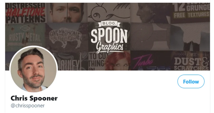
Chris Spooner, the author of a popular British blog, dedicated his feed to sharing the secrets of his professional skill. His expertise is attested to by the beautiful and harmonious design used in his header, as well as the eye-catching combination of the header with the profile picture.
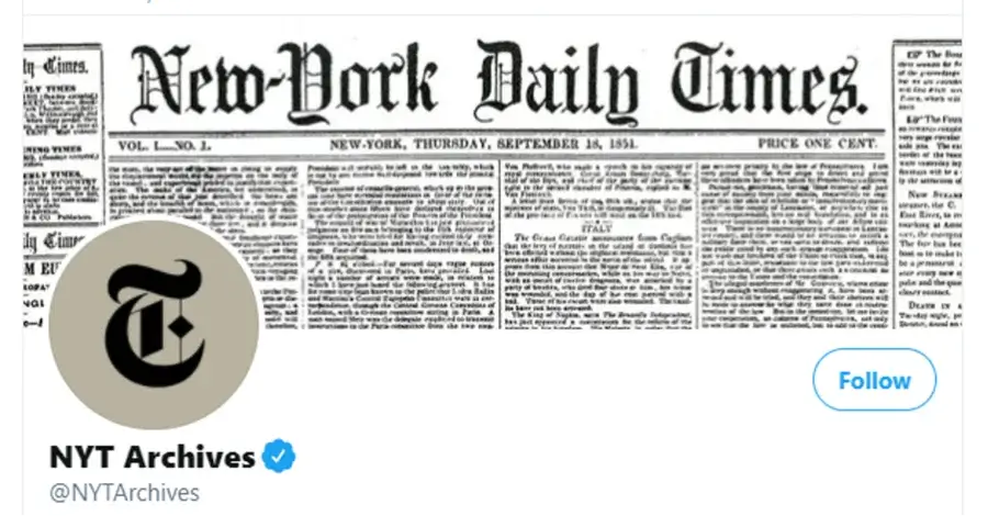
The world’s biggest newspaper archives every issue: in addition to the paper archive, all issues are digitized and posted on a website. Most of the newspapers are available in their original layout - and this is shown in the header. Isn’t that great?
3. Don’t Forget to Choose the Correct Twitter Profile Banner Size
The most prominent thing on any page is the header. A large image allows for a more immersive presentation of the brand or blog topic. Here are some examples of well-made banners (remember, 1500×500 px with a 3:1 aspect ratio).
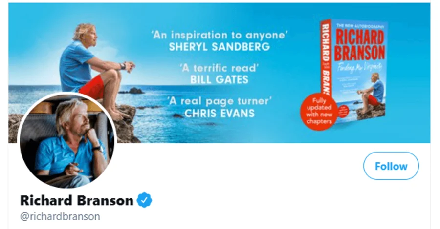
A week’s subscription to Richard Branson’s feed is said to be a successful substitute for a month of reading specialized business literature. We’re not sure if that’s true, but Richard’s page is just right!
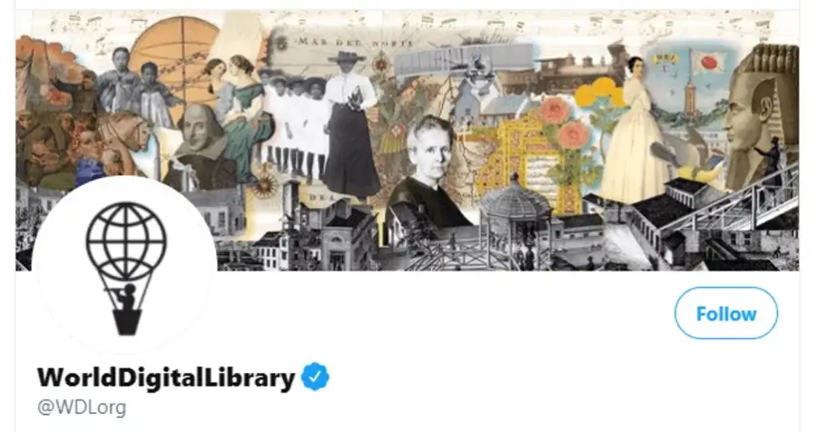
The World Digital Library is a project of the Library of Congress, the largest book depository in the world. Their cover reflects an interest in and appreciation for history.
4. Place a Slogan or Message
If your company has a short but resounding slogan, putting it in your header can be a very good idea. You can use a banner maker to help with your design creation.
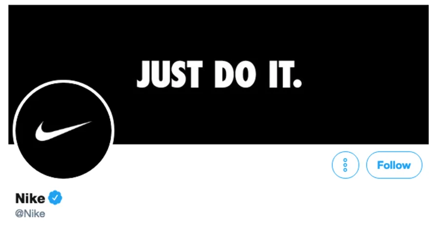
Perhaps the most striking example is Nike with their famous three words - a call to action. Look at how succinct yet aggressive their page looks!

The Merriam-Webster is another good example of how you can present yourself with a slogan or thematic hashtag. In fact, this entire feed is devoted to reviews of slogans and logos - interesting, right?
5. Make your Twitter Header Unique
If you or your company has a unique style, a face representing the whole brand, or a symbol, it’s worth using this to create a unique account that makes it easy to see that you are who you are.
Of course, when it comes to uniqueness, we often think of brands. Chanel is a great example of a brand whose unique style can be recognized everywhere. Including on their page.
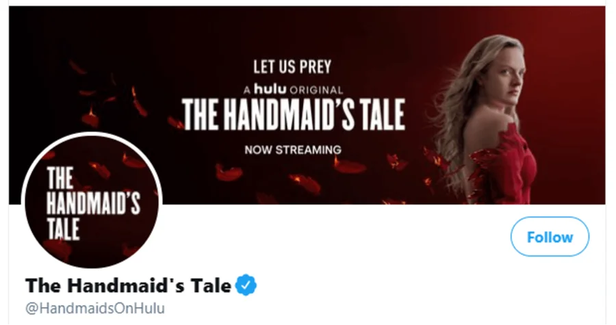
Elizabeth Moss is the face of The Handmaid’s Tale series, the element that provides uniqueness. That’s why Hulu uses her photo in the show’s account.
6. Be Honest and Persuasive
Nothing works as well as honesty, straightforwardness, and the power of persuasion. In combination, these three ingredients will attract anyone to you, whether your goals are to promote your product or simply to make a pointed joke.
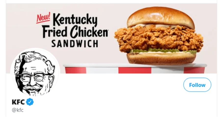
You can be honest and convincing even without slogans and banner lettering. Sometimes a bright and appetizing picture is enough. For example, that’s what KFC did - one look at their banner, and you’re already running to the nearest restaurant.
7. Remember Quality
Once again - 1500×500 px with a 3:1 aspect ratio! We will repeat it like a prayer until you remember it. Believe us, it’s really important! And here are a few examples to prove it.
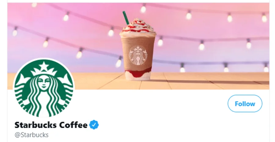
Starbucks knows how to play to its audience on any social network - including Twitter. When you look at their profile, the first thing that catches your eye is the picture. A high-quality, bright, and clear image of one of their drinks immediately draws you in.
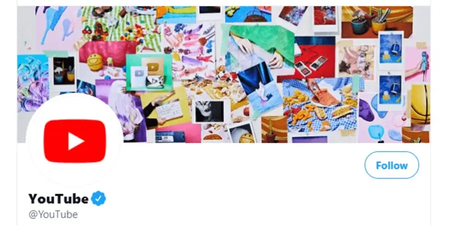
Another example would be YouTube’s cover. Despite having a large amount of fine detail on their cover, we can clearly see every picture and every object in all these photographs.
How To Use A Template For A Twitter Header
How nice that we live in the 21st century! Everything has already been invented and made for us - even templates for banners. With the simplest online designer today, you can create a professional background and make your page stand out with its design. You can create Twitter background size correct without too much trouble. Online you can find many templates, images, shapes, and clip art to make your work easier.
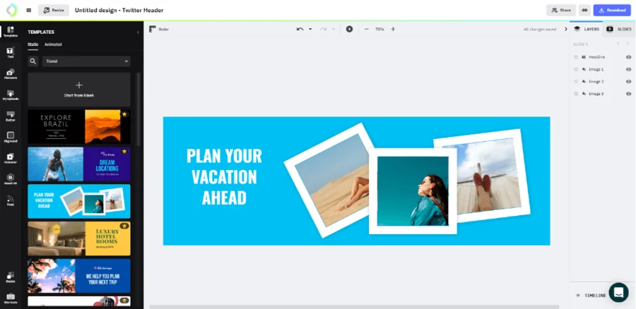
Creating a cover using a template involves four stages:
- Choose a Twitter cover photo size; the standard size of Twitter banner is 1500 × 500 pixels. Leave enough space in the lower left-hand corner for a 400 x 400-pixel image, and remember that part of your photo is usually cropped to fit.
- Choose a template from the hundreds of covers that are available in the online designer. Personalize your cover by changing images and text - create and add branded elements to enhance your online presence. Fonts, images, and shapes can be added.
- Upload the cover art to your feed. Once you are satisfied with the result, you can save it in .jpg or .png format and upload it to your page.
- Update your banner regularly, so your profile always looks fresh and attracts attention.
Near Misses with Header Dimensions and Style
A cover for Twitter is like a smile from the Mona Lisa. Without it, the page looks unfinished. So if you want your profile to come across well, you have to get it right.
Many aspiring bloggers make covers by arranging people/items/text in a random order and don’t even realize that you shouldn’t do that. Why not? It’s simple. We read pictures like plain text, so it’s important to arrange everything from left to right (just like we read books).
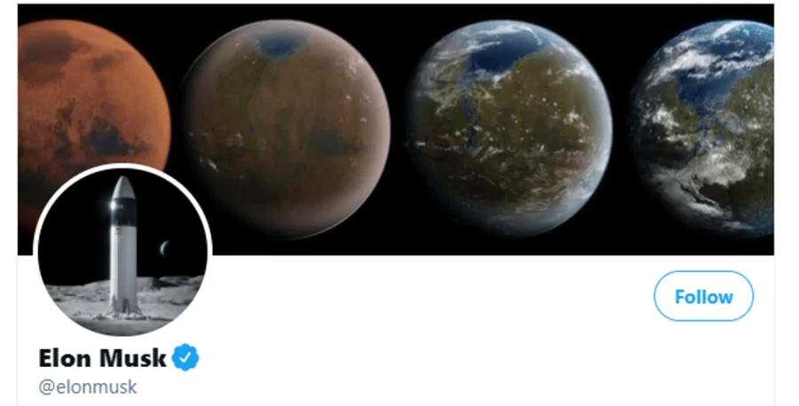
Another common mistake is to put random pictures on the image and the banner at the top. That’s how Elon Musk did it. What’s this? Rockets, planets… If it weren’t for the caption at the bottom, we would never know that this Tweet belongs to the founder of Space X (even though the whole feed is dedicated to space).
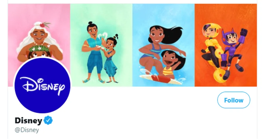
Finally, the last (and most common) mistake is to incorrectly calculate the location of objects in the picture. For example, Disney’s overlay of the page picture on the hat made the unfortunate Moana invisible. That’s why we leave a 400 x 400 pixel square in the bottom left corner of a header.
