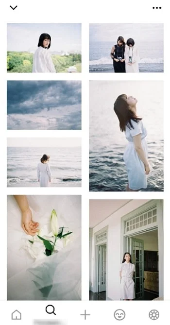
How to create a nice-looking Instagram account? Having an attractive account is crucial because, nowadays, users perceive the entire look of your account.
So, here are ten life hacks for working with your account and photographs as well.
1. Define a unified style
Use the same filters, same colors, same patterns, as well as, same people, and same clothes. A user should perceive your account as an integrated whole – the same theme colors and filters. That forms an impression.
2. Use special editing services
The demands of users have increased. Lots of high-quality content, excellently edited images, and professionally made photos have resulted in spoilt users. Thus, you should prepare deliberately!
There are lots of services, and I recommend at least two of them: VSCO and Snapseed. These two services are available for iOS and Android. They are pretty simple to use, so you just need to watch a couple of video guides to understand how to create amazing photographs.

3. Use the “separate stripe”
The “separate stripe” is a trick that presumes that every third picture is designed differently compared to other ones. It can be a different color pattern, or you can leave the first two posts uncaptioned and add a caption to the third one. You can also add numeration: tip one, tip two, tip three, etc.
Anyway, when users visit your page, they will see this “separate stripe”. It is better to highlight it in other ways as well: content, text, news-making issue. For example, you can create two lifestyle posts and post the third one as a tip. Or vice versa: two posts contain tips, and the third one is a lifestyle post.
4. Use the chessboard pattern
The chessboard pattern is a technique when you alternate posts. For example, you publish a photo post first and then post a captioned image. So, every second post is a captioned image. Alternating posts helps create an organic account that is easy to perceive.
5. Use titles
Traditionally, Instagram is positioned as a photo-content network. But nowadays, more and more people use a new approach where the main element is not the picture but the title. You write an article and create a title according to the unified style. Users visit your page, see the list of your articles and key workshops, and then choose one they are interested in, and watch it after all. This method helps you to create a visually solid and interesting portrait.

6. Experiment with frames
You can add the frame to every picture – white, black, pink, etc. Generally, it will look like there is the upper layer on the picture. That looks catchy and makes your account stand out.
7. Create flat lays
Flat lays are a frequently used format that is a part of the flat design. You interestingly arrange different objects and make a picture of them. The audience likes this format a lot because it attracts attention when scrolling the feed.

8. Remove unnecessary objects from the picture
Remove unnecessary objects from your pictures using apps, such as Retouch. For example, you have made a perfect picture, but there is a trash box in the background. So, you can remove it using an app. Another example: you took a photo of a few people, but according to the concept, there should be only one person in the picture. You can remove other people using this app. Therefore, you can create the desired composition even if the picture is already made. You can easily remove all the objects that spoil the composition.
9. Add more people to your photos
Add more people to your photos — the more, the better. It doesn’t matter how exactly you add them: arms, legs, heads, full-body portraits, etc. Instagram users always pay attention to all photos of people.

10. Capture items when using them
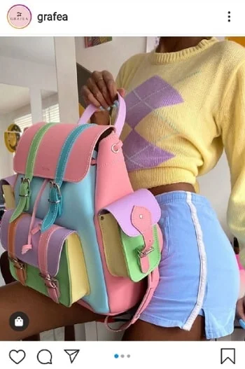
If you take a picture of the clothes, someone should be wearing them. If you take a picture of a bicycle, then someone should be riding it. That is the way to make users perceive the content better. This way, you get a better effect. Abstract pictures are not very efficient on Instagram. Obviously, there are some exceptions, but generally speaking, this is a rule to follow.


