Facebook cover photo size is displayed at 820 x 312 pixels on desktop screens. For those on mobile devices, the image size of Facebook Cover Photo is slightly smaller. The photo is then sized at 640 pixels wide by 360 pixels tall.
The image should fit recommended dimensions to make sure the photo is not cropped or distorted. The perfect file size for quick loading is under 100KB.
Facebook cover photos offer a great opportunity for personal or business branding so it’s crucial to create eye-catching visuals that represent your style or brand effectively.
This guide will go over the Facebook dimensions rules, template examples, do’s & don’ts and a lot more to help you create the most effective, impressive cover photos and videos.
Key takeaways
|
Before We Start: Terms to Know
In order to get everyone on the same page, it’s useful to go over the basic terminology that will be discussed in this article. There won’t be much technical information, but some terms you need to know are:
- Cover photo – It is a panoramic image space at the top of the Facebook page, above the profile picture. Businesses can use it to highlight their products, services, etc.
- Safe zone – It is a smaller part of the Facebook cover photo that is always visible throughout all of the social networks.
- Pixel – It is a building block of a digital image and is the smallest unit of information. For example, there can be 640 pixels from one side to the other and 512 pixels from top to bottom, which you can see one by one when zooming in.
- PNG – Portable Network Graphics is one of the most commonly used file formats used for lossless image compression.
Facebook Cover Photo Size
There is no denying that a Facebook cover photo size should be a large, high-resolution image. But with so many sizing guidelines (covers, profile photos, link post images and Facebook banner size.), it’s hard not to get confused. Here are the technical specifications:
According to Facebook, your cover photo is displayed at 820 pixels wide by 312 pixels tall for desktop users. For those on mobile devices, the photo is sized at 640 pixels wide by 360 pixels tall. If the FB cover photo size does not fit the said dimensions, it will be automatically adjusted.
Luckily for Facebook users, all photos are resized to fit the cover space. Depending on the initial dimensions of the picture, it will be either be stretched or cropped. The automatic adjustment does not distort the image. However, it might become blurry if it was too small with low resolution.
A cover photo is the single largest image on your page, and it can make or break your relationship with a first-time visitor. If your chosen image is not consistent with the Facebook cover guidelines, you could face several problems. For example, the image may turn out pixelated, as said previously. Also, part of the text can be cut off, or the whole layout can become clumsy.
Facebook Header Size on Desktop vs. Mobile
The design of your Facebook cover should take into account the inherent differences in how it will be displayed on various devices. If you want the image to be suitable for both desktop and mobile viewing, you can refer to the concept of safe zones.
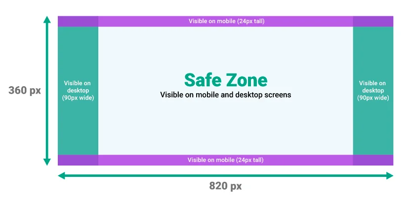
As seen on the figure above, mobile and desktop versions cut off noticeable amounts of the original image. Therefore, it’s best to place the main part of your image as well as the text part in the center. Them, there will be no risk of important information being cut off.
Some people find it frustrating that you can’t upload different images for desktop and then for mobile. To mitigate this problem, you need an image size that will accommodate both formats, which is generally accepted at 820x360 pixels. You can see in the images below how Facebook automatically resizes the same image, but it is already designed with this fact in mind.

 ”
” There are more and more reasons to adapt your pages to mobile devices. For instance, there are 71% more users visiting the website from mobile devices than from a desktop. So, it helps if you make your content accessible to everyone.
Facebook Cover Photo Best Practices
With all of these rules and sizing guidelines, the process of creating a Facebook cover can seem quite intimidating. To simplify the task for you, we’ve gathered practical recommendations and the most important points to keep in mind. There is a ton of room to be creative – just make sure the cover image follows three main principles:
- Text – A brief slogan can be a powerful tool to boost engagement. Some complimentary text adds another way of communicating with users and allows you to promote your brand’s message effectively
- Emotion – If you invoke an emotional response from visitors, they are more likely to remember the content they viewed. For example, connecting the brand with the feeling of friendship, inspiration, warmth, and happiness contributes positively to customers’ purchasing decisions
- Relevance – A cover image should match your audience’s interests as well as your brand voice. Find a balance between being useful to the visitor’s search and reinforcing your beliefs as a company.
Once you learn these basic principles, it’s time to take a look at other useful tips. Let’s dive into practical recommendations on how to create fitting and visually striking Facebook covers:
- Comply with Facebook page cover photo size guidelines
It never hurts to take a look at the official Facebook guidelines. There are no specific consequences for non-compliance, but you don’t want to risk getting your Facebook Page taken down. You can always refer to the guidelines when selecting a photo:- Covers are visible to the public
- Cover photos can’t be deceptive, misleading or infringe on anyone’s copyright
- Keep the dimensions in mind before uploading a photo
- You can’t include price or purchase information or encourage others to upload your cover
- Make your cover image eye-catching
![]()
Whether it is a photograph, a hand-drawn illustration stock image, or anything else in between, make it visually striking. You can really go all out with color. The color palette can make a big difference in how your audience views the image and influence them in various ways. Play with different colors to change the tone of your piece – they can be bold, subtle, or romantic, depending on what you are aiming for. - Transform the old ‘20% text’ rule
The old Facebook rules allowed no more than 20% of your cover photo to be occupied by text. But even though this rule is technically gone, the overall sentiment behind it was useful. If your cover image is going to include text, try to make it concise. - Use colors that match your brand aesthetic
![]()
A uniform color scheme makes all of your channels consistent. Consider your Facebook page as an extension of your entire business. If you have specific colors that are used in your physical and online stores, you can include them on your social media platforms as well. That way, your brand and logo will become more recognizable. - Make it clear and simple
![]()
An uncluttered image grabs the viewer’s attention much more effectively than the one covered with details. Carefully evaluate exactly what you need to include. Even though you might be tempted to provide heaps of information, you shouldn’t inundate people with tons of stuff. It doesn’t necessarily mean that you have to be minimalistic. The overall sentiment is that you should make the image recognizable – and the less detail you include, the easier it will be. - Don’t try to integrate your profile pic into the cover image
The old Facebook page layout allowed users to make some tweaks and blend the profile picture into the cover photo. If you come across this advice, bear in mind that it is no longer applicable to business pages. - Promote your latest events and products
![]()
A seasonal and relevant cover photo can be used as an announcement to new products/services/events. Thus, you will bring more awareness to whatever you are promoting but in a subtle and visually pleasing way. Also, if you change up your covers from time to time, it will keep your audience more interested in the contents of your page. - Complement the action buttons with design
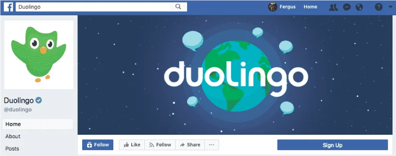
You can try to accentuate call-to-action (CTA) buttons like ‘Sign Up’ or ‘Shop Now’. While Facebook used to prohibit designs pointing at these buttons, there are no longer such restrictions. However, remember that the layout changes on mobile devices. - Experiment with shifting the focus to the right
![]()
The current Facebook layout places the profile photo on the left, while the cover occupies everything on the right side. The more prominent elements of your cover can be on the right to have everything evenly spaced. It makes the whole arrangement look more balanced and creates some negative space. - Include a cover photo description that supports your CTA
If your Facebook page or marketing campaign has a particular CTA, add it to the new cover photo description. It is another way to make all of your channels and formats cohesive. Plus, you can include a link to your offer so that visitors will have direct access to it. - Remember about the mobile user experience
![]()
![]()
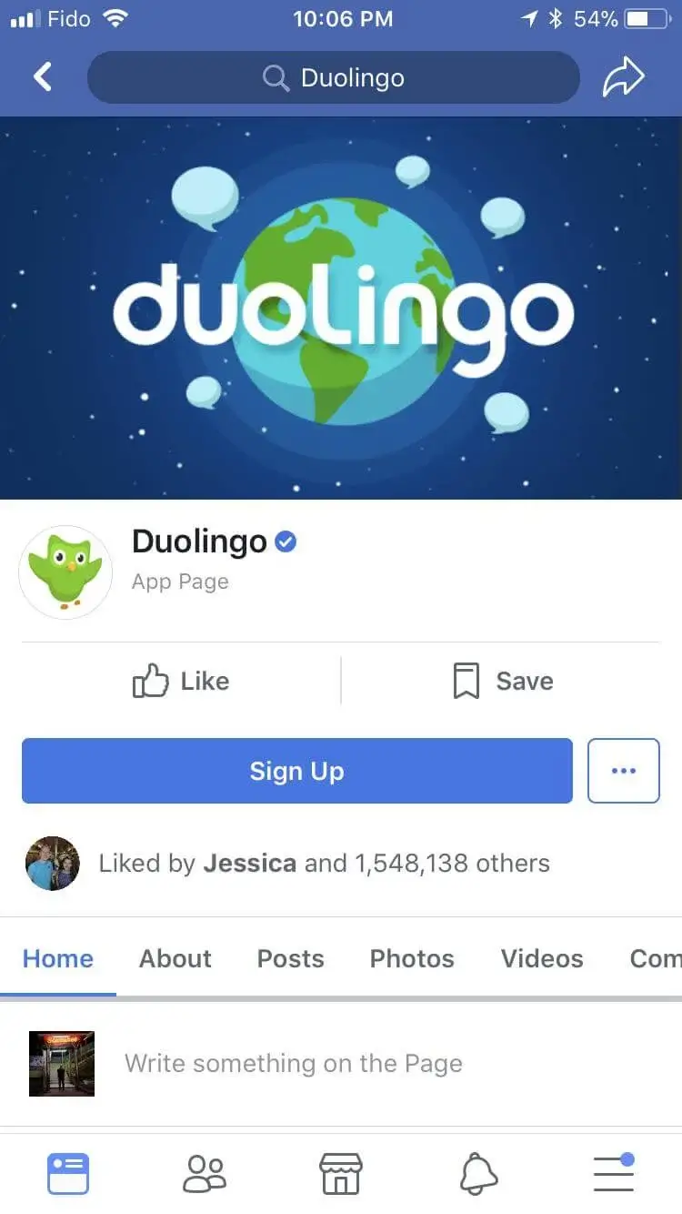
As mentioned in the section on the Facebook cover photo dimensions, you need to design it with mobile users in mind. You don’t want to isolate a huge portion of your audience. Once you settle on a certain image, test it on multiple devices to see how it fits different layouts and screen sizes. - Pin a post that aligns with your Facebook cover image
When you have multiple elements for the same cause – your cover photo, description copy, a CTA button – you can complete this set with a post about the same thing and pin it. The post will be highlighted at the top of your Timeline for seven days and contribute to better conversions. - Use your cover photo to drive traffic to your page
Chances are you have put a lot of time and dedication into crafting a cover photo. So, you want it not only to be pretty but to also give you a competitive advantage. While you shouldn’t plaster ‘Buy me!’ or ‘Offer ends today!’ all over it, you can use subtle ways to drive the leads you’re looking for. For example, include a sharable hashtag, start a challenge or something along these lines.
Mistakes to Avoid
While you are free to put up any image as your Facebook cover, some choices can have a detrimental effect on your page’s performance. Here are some common mistakes along with reasons why you should avoid them:
- Same cover photo for different purposes – Dimensions of cover images for Facebook events and Facebook group cover photo size vary, so you want them to be optimized. Otherwise, incorrect sizes and resolutions can look off-setting. Plus, you want individual pages to be recognizable and not mimic each other
- Too much text – Excessive text creates information overload for the audience. The best approach is to reduce the wording to a minimum to make it stand out. Try to also avoid spreading text all over the image
- Too much clutter and detail – Similar to the point above, you don’t want to make the image overwhelming. In order to reduce the cognitive load, get rid of everything that is not absolutely essential
- No regard for page format – You need to remember the details of your Facebook layout. Part of the cover image is going to be cut off by the profile picture and name (for the desktop version), or the side will not be visible (for the mobile). Check if the text is fully visible on both versions and that the cover does not replicate the profile pic
- Generic and forgettable image – By not including a custom image, you are missing the chance to make a strong visual impact. These days, people go through a lot of content, so you want to attract their interest with something they haven’t seen. A well-designed, unique cover will convey who you are more effectively
- No clear branding – This mistake is another way of making your page less memorable. Custom colors and logo branding contribute to brand awareness, which, in turn, helps with your market positioning. Make sure to keep it subtle and straightforward since users tend not to enjoy ‘in-your-face’ content.
Examples of Perfect Facebook Cover Photos
Many brands are already following the recommendations given above. Here are some great Facebook cover examples that you can take notes from.
<
div align=center>
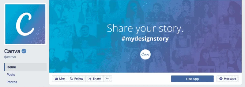
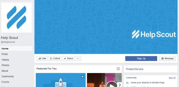
The first one is a graphic-design tool that uses its cover image to encourage users to post with their hashtag. It combines complementary colors, sleek design, and clear branding. The call-to-action text grabs visitors’ attention but doesn’t overpower you with too much information.

The next one is a television network that promotes one of its most popular shows at the time. This poster adds relevance to the pages and can be used in other social media posts to complement the entire marketing campaign. The colors are bold and noticeable, and there are no details on the sides, which makes it easier for the user to focus.
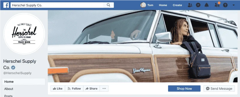

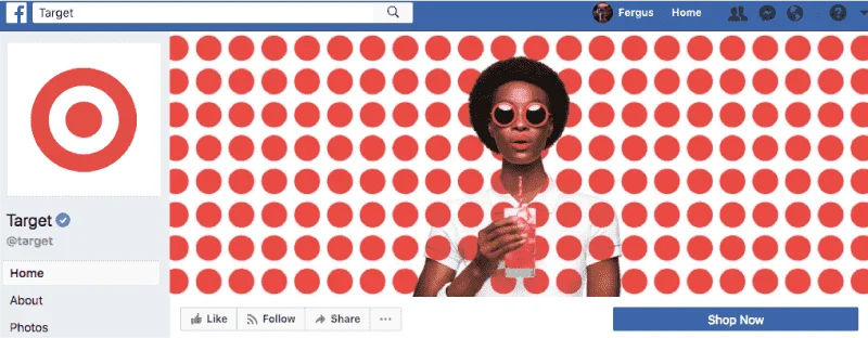
Lastly, here is an example of how to locate the image to make it work on all devices. The cover is right-aligned, which complements the profile picture on the left and evens everything out. The company specializes in retro-inspired accessories, and the image matches the brand aesthetic.
How to Create a Facebook Cover Photo: Step-by-Step Guide
Suppose you have an image that you want to crop according to the Facebook cover image guidelines. Here is what you need to do.
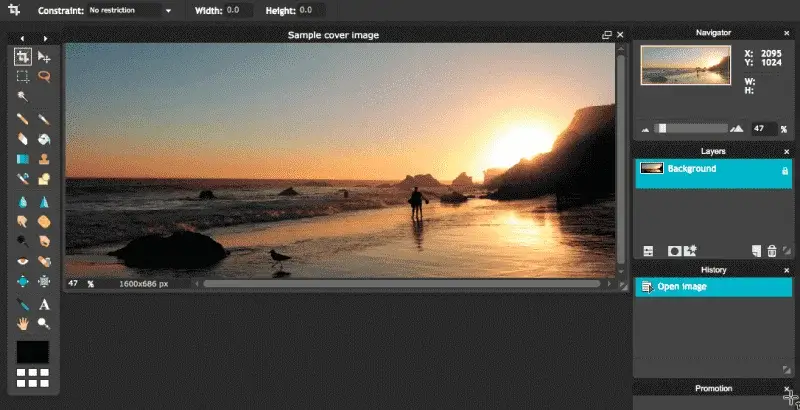
Step 1. Working in the online editor
Open a free online editor pixlr.com.
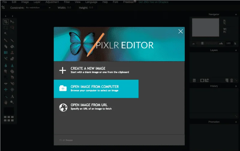
Step 2. Upload the image
Upload the image into the working area.
Step 3. Set the width and height
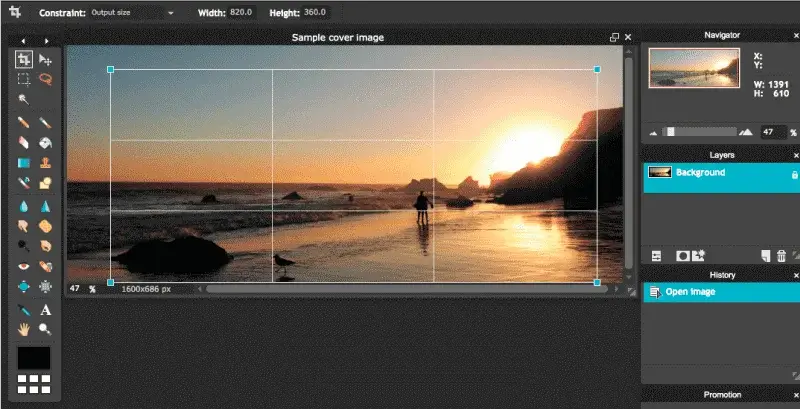
Change the ‘Constraint’ tab to ‘Output size’ and set width and height to 820 and 360 accordingly (this is the optimal image size for both desktop and mobile). Drag the cropping tool depending on how you want to cut it and press ‘Enter’.
Step 4. Change the format
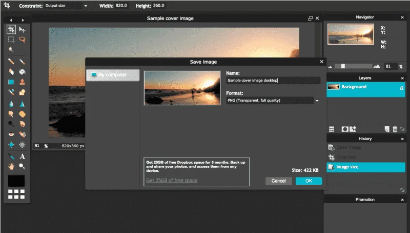
Go to ‘File’ – ‘Save as…’ and change the format to PNG. Save the image to your computer.
Step 5. Upload Photo
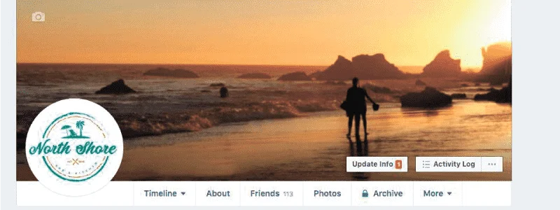
Go to your Facebook page. Tap on the Add a Cover or Change Cover in the top left and choose ‘Upload Photo’.

Step 6. You have a new cover
Click the chosen photo and save the new cover. You’re done!
Facebook Cover Video
Instead of a cover photo, Facebook Business Pages now have the option to upload a cover video. The main intent behind this feature is to make more engaging interactions and richer experiences for users. The video format opens up more possibilities of what the brand can share: provides useful information, showcases their product/service, offers a behind-the-scenes look, etc.

A Facebook cover video should be at least 820x312 pixels, but the recommended dimensions are 820x462. The resolution can be up to 1080p and the file size must be less than 1.75GB in .mp4 or .mov. As for the duration of the video, it should be between 20 and 90 seconds long.
Bear in mind that all videos are displayed on the loop, meaning it plays continuously until a user exits the page. Therefore, make sure it starts and ends with a natural loop to achieve a natural transition across loops.
The video shouldn’t contain anything that will seem tiresome or too flashy when played over and over. That will create the opposite effect of what you are trying to achieve with a cover. Instead, try to balance out the captivating content without being too intense. Just like with pictures, brands can tease or promote their products, add CTAs, and some text and share their message with the audience.
Examples of Facebook Cover Videos
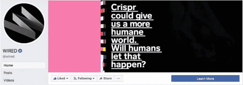
This monthly magazine uses the cover format to draw attention to their upcoming issue. The video zooms out slowly enough so that the text remains readable, and all used colors are bright and pronounced. It doesn’t look like a magazine cover at first, which makes viewers spend extra time looking at it to see what it is.

The next example is an online training platform. The motivational component perfectly aligns with the brand’s message. Plus, you can easily translate the visuals into a post for other social channels. The animation is simple yet creative and has enough elements to encourage users to take a closer look.

The most minimalistic example is an outdoor gear and clothing brand. This peaceful lapse is exactly what we meant by not ‘being too intense’. It captures the essence of the brand and communicates what customers might feel when using their products.
