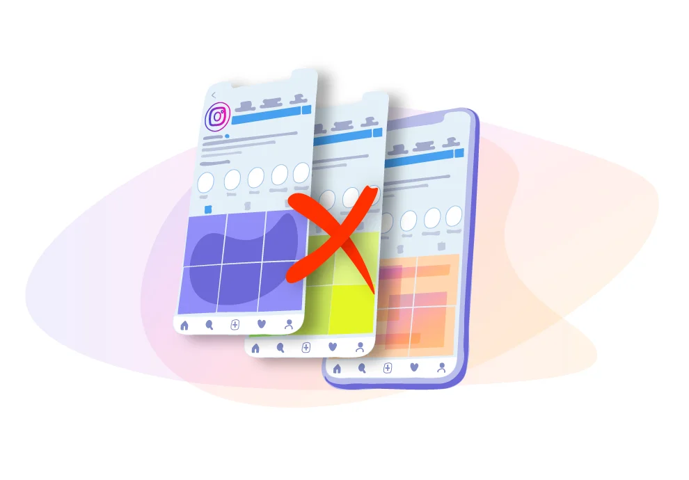

“Seamless” Instagram Feed
The biggest mistake is the “seamless” Instagram feed. It means that you create posts with photos that are related to each other. As a result, users can see a puzzle in your profile that, without any doubt, looks cool, but only when you upload three photos in a row. Every time you post a new one, everything shifts and looks like a mess. If users visit your page during this “messy” period, they will not understand anything.
The seamless Feed was a big trend probably 3 or 4 years ago. But not anymore. It takes a long time to prepare. You need to plan your 9-12 Feed posts, and all your content will depend on the design you already have. You won’t be able to post instant photos or publish significant announcements to your followers. This kind of content just won’t fit into a feed like that.
One-color Feed
It was popular, probably, five years ago. But even now, you can still find an account where pictures are edited using one color: blue, green, red, etc.
The other way to create this style was using one lead color on the Feed. For example, in one photo, you hold a red mug — on another, you use red lipstick, a red leaf from a tree, or a red rose.
To keep the profile looking good with this style, you need to either bother with creating photographs, select them carefully, and look for locations of the desired color, or edit the sea color to the one you need.
Strong photo editing
Currently, the most popular trend is a natural look, nature, and minimal editing, which is specific editing.
Over-photoshopped pictures, high level of sharpness, strong contrast, bleached teeth, smudged, skin or bright poisonous colors are also out of fashion. Therefore, if you still want to add a lot of editing to your photos, do everything as you like first, and then remove 30% of it on all sliders in your editing apps so that users will not notice too much editing on your photos.

A simple post scheduler for all platforms, a user-friendly media editor, and posting at the time you need — Onlypult provides this all.
Text boxes
Templates and text boxes are considered out of fashion now. There is a slight difference here. Everything depends on how the text looks — whether it is aesthetic or not, if there is an attractive text bubble or not. Still, the general trend is to avoid templates.
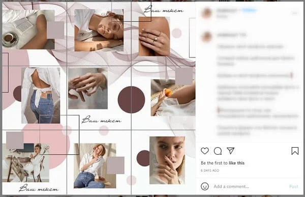
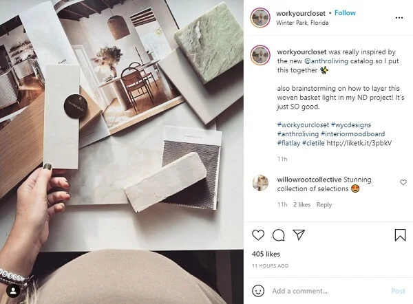
Flat-lays
The problem with flat-lays is that they look pleasant and aesthetic, but, unfortunately, they all look very similar.
You should make sure that you can personalize such pictures so that people know for sure that you are the author, or just try to avoid posting flat-lays to your profile.
Quotes
Another anti-trend is the staggered rotation of your photos and pictures with quotes. Keep in mind that you cannot use other people’s quotes!
If you have any thoughts that you want to share with users, you can publish them in the carousel on the second or third slide so that people can share them with others if they wish. Still, you shouldn’t add this to the main Feed.