The popularity of micro landing pages is increasing. The trend comes from the speed of consuming such content. Instagram has made spontaneous purchases a routine for us. A micro landing page is like speed dating: you see a value — you place an order. We will compare five services that can help create a micro landing page without any special skills.
Micro landing pages solve the majority of marketing tasks. It is especially popular for small and medium-sized businesses when a product line is constantly modified — and the speed of deciding whether to purchase or not is slowing down when selling on Instagram.
Sell right on Instagram. Tell people about your products or services on stories or in a post, give a direct link to the short description or fees and prices or payment.
Launch new products and services. Test whether a product or service is in demand when this idea comes to your mind. You don’t need a designer to make a micro landing page — you can easily and quickly do it yourself.
Promote webinars. A classic webinar landing page is single and small. If you do live meetings — invite your audience to register via the link in the description.
Study your audience. Do Customer Development, an easy test of product or service demand. Post a survey and give a gift for participation.
Track the user path. Analyze the new page traffic and conversion rate of buttons, it will come in handy in making multiple page web site for a company.
Service comparison
We have chosen five popular services for making micro landing pages and compared them according to core indices measuring the interest of bloggers and businesses.
Onlypult
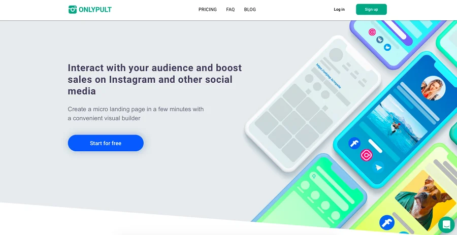
It is a comprehensive and convenient constructor with all the necessary features for a micro landing page. Tools available for creating a micro landing page are a profile picture, text, divider, additional buttons, and social media and messenger adding capability. Besides, premium plans allow you to attach photos and videos. The hallmark of this service is its stylish design.
Onlypult features a handy analytics tool. You can monitor user activity over a certain period and count all the clicks.
There are several plans available. You can make one page and add up to 10 basic blocks for free. The customer support is online 24/7. You can get a $5 premium plan providing 100 blocks and an additional premium block package.
The Business plan costs $19 — it provides five pages. Besides, the service allows you to choose a plan according to individual preferences if it is necessary to create more than five landing pages.
We should definitely point out that this service has a lot more functions than just creating micro landing pages. With this service, you can post to all major social media, build websites, track and analyze statistics.
Advantages
- Stylish design,
- Intuitive interface,
- High performance,
- Many helpful services in one place,
- Quick registration via social media.
Disadvantages
- Only 10 blocks are available within a free plan.
LinkTree
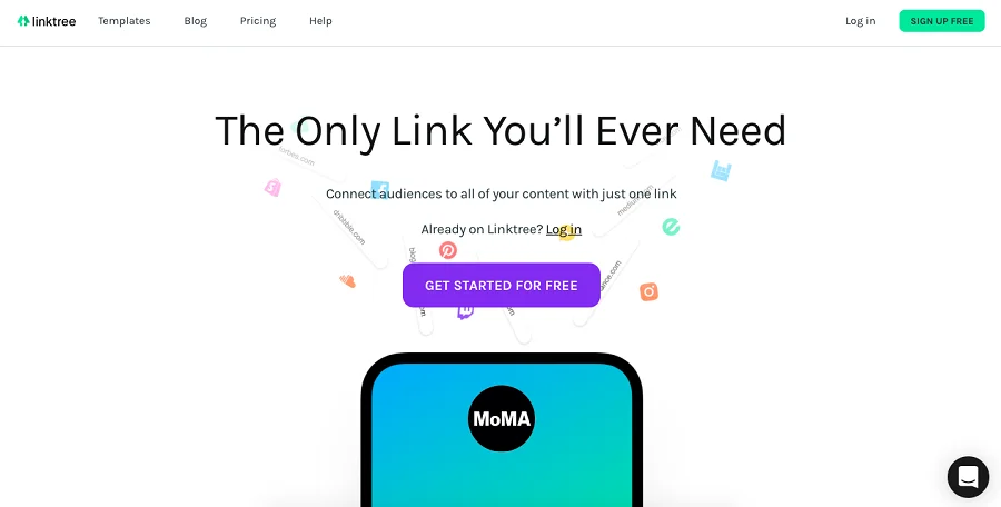
It is one of the oldest services for multi links. When signing up, it looks like a free one. But it has a paid plan as well. The service is most popular among English-speaking audiences, and Russian speakers do not use it very often due to the English interface.
You can sign up only via e-mail — registration via a Google or social media account is unavailable.
You can add an unlimited number of links to other websites and messengers. There is a money collection feature — you can get donations, tips, and other small payments.
The PRO rate costs $9 or $6 per month if you get an annual subscription. There is a specific corporate plan.
Advantages
- You can add unlimited number of links to other websites and messengers.
- There is a set of integrated themes with which you can create your link tree.
- You can track views and clicking history during the link thread existence.
Disadvantages
- In the free version, you can use only a few design templates.
- Interface in English only. Using the built-in browser translator simplifies the monitoring of the landing page creation process. But it is still not full functionality.
Tilda
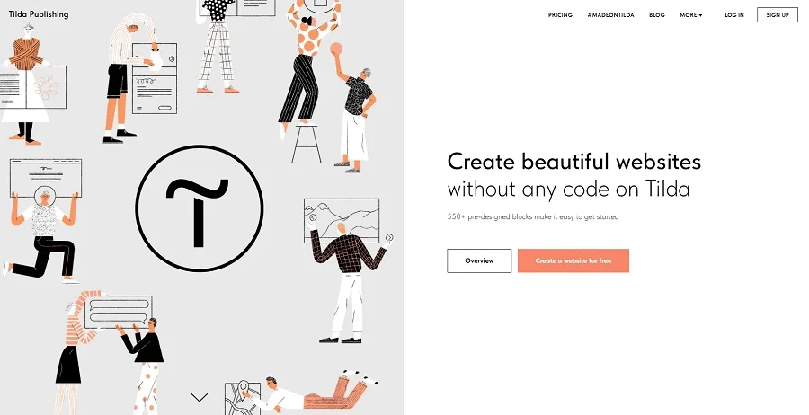
It’s not a multi-link aggregator but a complete website constructor with which it’s also possible to make a link tree.
Tilda’s key difference is a stylish design and strict requirements for aesthetics. The platform is pretty easy for beginners, and an advanced user can make a real masterpiece from scratch —it has beautiful templates.
Tilda has many possibilities for individual settings: you can get into detail for long and polish the layout. The platform has more than 210 templates and more than 550 block types.
There is a photo editor, and you can add pictures from a built-in library. You can add video and audio on the landing page. The editor lets you edit each element and add animation. If you use it right — you can create a totally unique product.
If you pay for a year, you’ll get a free domain. You can create only one project for free — paid plans start from 500 rubles per month (if you get an annual subscription).
Advantages
- Handy and aesthetic templates.
- You can add your own designs.
- You can learn how to create websites with Tilda — there are educational programs, videos, and manuals.
Disadvantages
- Very few free features (only 50 out of 550 templates are available).
- Too many features which may confuse beginners.
Lnk.Bio
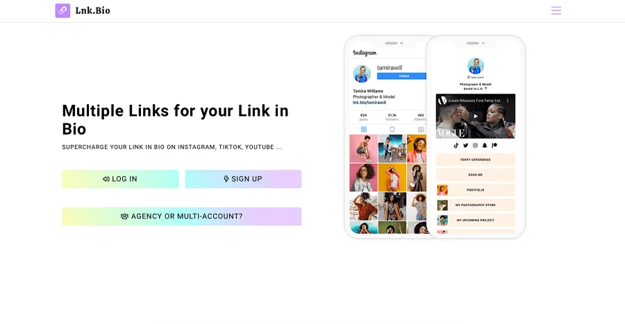
You can register via TikTok, Facebook, Apple, Twitter, Google, an e-mail, and many other less known services, for example, Line. me.
In the free version, you can add an unlimited number of links. The disadvantage is that you cannot choose a unique URL. The paid plans are not expensive and give you 27 templates.
Plans. MINI for one month ($0,99): After the payment, you get a unique URL and statistics on clicks and views of the links posted on your page. There is MINI for $9.99 (a lifetime one), the functions are the same.
UNIQUE — $24.99 (once and for always). In addition to MINI options, you can remove the logo and footer of the Link. Bio, add your wallpapers, favicon, images, and banners. There is a planner for Instagram posting.
To make an easy-for-understanding landing page — you can add an image to each link. You can also schedule posts. It works well when a link redirects to an Instagram post — and you want it to be shown after the post is published. You can publish both links and videos on a landing page.
You can delete links and also edit their content, images, and positioning. You can adjust the landing page for viewing it on a PC or mobile screen.
Advantages
- Free or cheap use,
- Ability to edit and move links,
- Usage of images and video with links,
- Unique URL available on paid-plan,
- Page’s adaptation for various devices,
- Statistics.
Disadvantages
- Only 27 templates are available.
Bio link
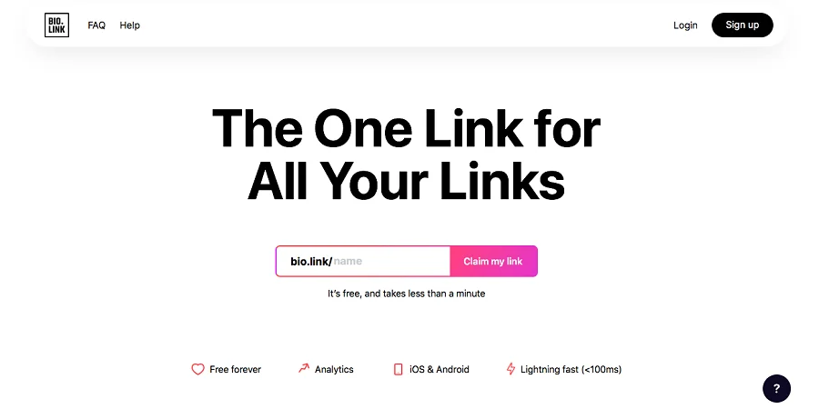
When registering, you can “claim the right for a link” to start the landing page-making process automatically.
You can use the majority of essential functions for free. They are analytics, themes, and integrations. With the paid version, you can use the Follower function for sending e-mails to your audience. You can add an unlimited number of links, even in a free version.
Creators focus on the performance speed of the service. You can easily notice it has an intuitive interface, fast page loading, and easy registration form.
You can create your own theme for the landing page, but there are a few tools for that: background-color choosing, the ability to add a gradient or attach an image, a few button patterns, and nine fonts, some of which are out of date.
This service aims at a creative audience, especially artists, authors, musicians, and bloggers.
Advantages
- Fast start: it takes just a few seconds to choose and start using URL.
- Individual URL with its own name under on a free rate.
- An unlimited number of links with editing options.
Disadvantages
- There are only 14 theme templates and limited functions for making your own theme.
Examples of different types of landing pages
1. Landing page
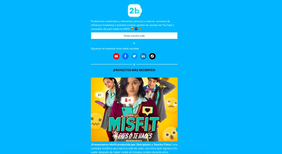
Example of a landing page — 2btube mediagroup
It looks like a full-fledged landing page. It contains all basic information: profile picture, more detailed biography than the one on Instagram, and links to social media accounts.
Below you see links to videos and articles with large illustrations with which you can get an idea about the contents to which leads the redirection. There is text with additional information at the bottom of the page.
This type of micro landing page is for those who do visual arts, especially videos, and those people and companies who do unusual work that needs to be shown from many sides.
Keep in mind that to create your microsite or landing page it is essential to have a hosting and a domain name. Hosting is a space on a server that will allow you to save and publish online the files that are part of your site, and the domain is the name with which users will find you. Review dinahosting offers to get the best price on hosting and domains.
2. Expanded card
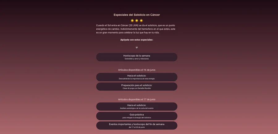
Example of the expanded card — miastral.com project
This type of landing page is completely different from the previous one. It has very little text — short explanations on a few buttons and no bio, but attractive images with brief titles.
Such a micro landing page is for official organizations and bloggers with a reading audience (for the author of book reviews, for example).
3. Product/service

Product example — Superfeet project
This type of landing page is completely different from the previous one. It has very little text — short explanations on a few buttons and no bio, but attractive images with brief titles.
It’s great for bloggers — even vloggers and shops that want to emphasize the visual component of their products.
4. Online Business Card
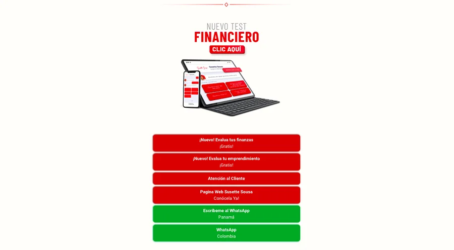
Example of the online business card Susette Sousa financial project
It is the most concise and popular type of micro landing page. There is nothing extra — just a name, profile picture, and a few buttons categorized by color (articles are separated from links to messengers).
Short names on buttons help users to navigate through information. It has quite a convenient layout that does not take long to make and go through.
5. Display
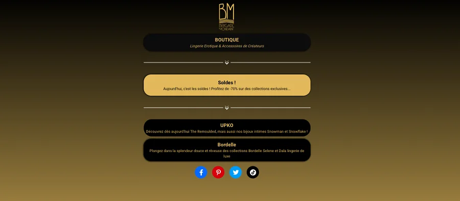
Example of display — shop Brigade Mondaine
That type of landing page is similar to the third one but has less text. It is like a shop display — there are only pictures of products with descriptions. Essential contacts are at the bottom of the landing page — you can find all the details about the product line following the links.
Summary
A micro landing page is an effective way to give your customer maximum information quickly and briefly. There are some services to create a microsite — some have free rates. A unique URL is a thing.
Choosing the template for a micro landing page, you need to understand its goal. If it’s vital to show the product — choose a service where you can easily load a picture. If you want to share article links, make a high-quality online business card.
And don’t forget to go back to your micro landing page regularly for editing it according to your current agenda.


