
The first thing you need to do when thinking about promotion on Instagram is styling your profile page wisely and correctly.
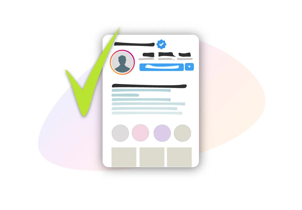
Say, you have launched an advertising campaign, and now users get redirected to your account. What is the first thing they see when they open your profile? The users are most likely to see the account header, highlights, and maybe the first three posts. Many scientists and marketers write people decide whether to follow your account within the first couple of seconds after they open it. That is why it is crucial to style it correctly.
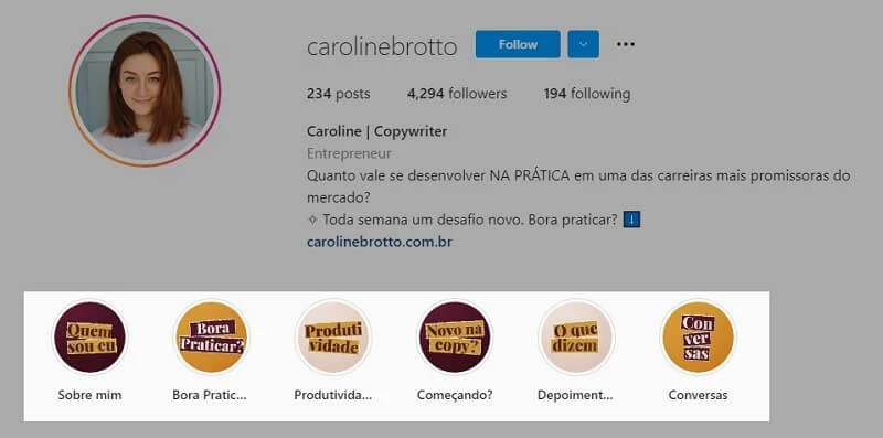
Profile picture
The first thing users see is your profile picture. Your portrait needs to be quite zoomed in. Photos with a lot of minor details are not relevant here. Users should be able to recognize your face in an image immediately. If you try to use a full-height picture or a photo up to your waist, it will have too many details. That is why only use a picture of your face that clearly shows your emotions and that it is you. Have nothing in the background because that can distract attention. User attention needs to be focused on your face and your personality instead.
Name of the profile
Many people make a mistake here by using fancy fonts. Avoid doing so. It is more important to let users know who you are and what you do. Use the available space wisely. Add your name and surname, or only your name. Let users know what you do.

Channel description
Many users underestimate the importance of the description. A description is necessary for users to understand who the owner of the profile is. It is like a business card. In a limited space, write all the vital information. Tell who you are, whose account it is, and why it is worth following. You can achieve this with the help of a description.
Write it in simple words, without elaborated fonts and a myriad of emojis. Write the description in the language that most of your audience speaks. If you are wondering what to write in the description — here are three aspects that you should mention:
- What you do;
- Your key advantages, expertise, and other information contributing to your status as an expert. The idea is not only to tell users what you do but also to explain why they can trust you.
- Something personal. The description shouldn’t be a bland enumeration of facts. It should dwell not only on your business — but also show your personality, humor, and your views.
The core moment here: you shouldn’t immediately motivate users to follow you. It can be a slight hint about what you write and what potential value users may find in your Instagram account.
A link to a website
Below, there is a link to a website you can use. You should not only add a link — but also write a call to action.
What type of link can you add, and what is the point of using it? There are a lot of options here. The most popular one is to use a hyperlink.
A hyperlink is where you add all your contact details, communication channels, social networks, and other useful links. What is a common mistake here? People commonly use only one communication method, for example, a link to WhatsApp or Telegram. To make it convenient for the users, you can add a hyperlink with links to a website, YouTube, VKontakte, Telegram, and WhatsApp, so that users can choose the most convenient way to get in touch with you.
Another common mistake is when users add their email, links, and phone numbers to the description. Avoid doing so. Use descriptions only for texts.

Free multiple link features specially for you.
Highlights
It is a crucial and integral part of styling your account. Style Highlights with a name and cover. Never add text to Highlights. Sometimes people try to add the name to the highlights and add emojis below to the title box. Thus, the text becomes too small and illegible. Long words become very zoomed out and impossible to read.
What to add to Highlights? It can be the core aspect of your work. If you sell products, it can be different catalog sections, Q&A, reviews and feedback from your users, photos from events, and public speaking.
What are the common mistakes here? The first one is a long title. Remember that the title box is tiny and can only fit one or two words. Avoid long sentences because they will be cut short. The icons for the Highlights should also be obvious. It should be clear at the first sight what the icon is about — a YouTube logo for YouTube videos or a Like icon for reviews.
How to style a corporate account
For a corporate account, you can use a company logo. Do not use a logo with text. Otherwise, it will be impossible to read the company name because the picture is too small.
In the description, write not only the name of the company but also what it does. Be concise and clear, and avoid unnecessary fluff.
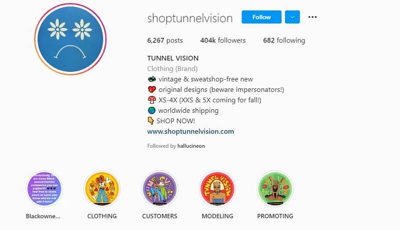
Don’t forget about the hyperlink that users can click on and choose convenient communication methods: WhatsApp, Instagram, or phone number.
Highlights are another method to attract users’ attention. Avoid creating many highlights and focus on the main ones that tell users about the company and job and share the account values.