

Infographics are indispensable in social networks and often go viral - users repost, share with friends and save them. Such the format makes it possible to simplify the perception of information: it is easy to explain complex things.
What attracts users to infographics? There is no “waffle” - systematized data “sells” an idea better than a pile of figures, facts, thoughts. Users will appreciate such a modern way of presenting content. The main points are highlighted, everything is given in a nutshell — and all you need to do is just remember it.
Let’s consider the main stages of working on infographics and analyze successful examples that will help you note everything you need to create such graphic content.
Where to get started on infographics
If you’re looking for viral reach, choose the broadest topic possible, but avoid clichés. A simple “googling” can help not repeat and not waste resources on what has already been done.
When drafting a brief for infographics, prepare a text prototype. Mark up graphic elements — icons, flowcharts, and diagrams. Do not go too heavy with elements and meanings. If you want every detail to get explored, make 3-5 slides. Check at each step to see if anything else can be cut or removed.
When choosing an idea to work on, you can focus on one of the types of infographics. That will seriously help at the stage of information gathering and fact-checking: it is clear what is required and what data is not required.

Onlypult posts to Facebook, Instagram, TikTok, VKontakte, and many other platforms. It has a user-friendly post editor and allows collaboration.
10 infographic formats for social media
Statistics and facts
Cold facts are boring. To delve into a topic, especially if it is not familiar, is just a waste of time. Therefore, if you want to share the study results, it is better to arrange them in infographics. The media appreciate such a type of infographics.
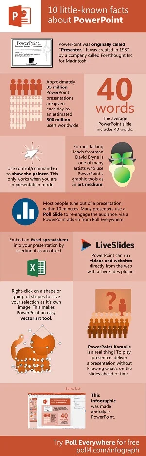
Example. A type of infographics that tells about ten little-known facts about Microsoft PowerPoint presentation software.
What works well: Microsoft PowerPoint functionality is shown natively.
Infographic lists
SMM specialists confirm: if you want to get saves and shares — draw up a list. It can be a selection of books, films, TV series, services, training sites, online courses, brands, and efficient techniques. There are many options.
Example. Infographic with five tips on how to stay fit. Quick tip and description.
What works well: A good topic, the ease of perception, and arrows that lead to points.

Abstracts
We especially recommend paying attention to this type of content for anyone working in online education. Current and potential students will save such infographics.
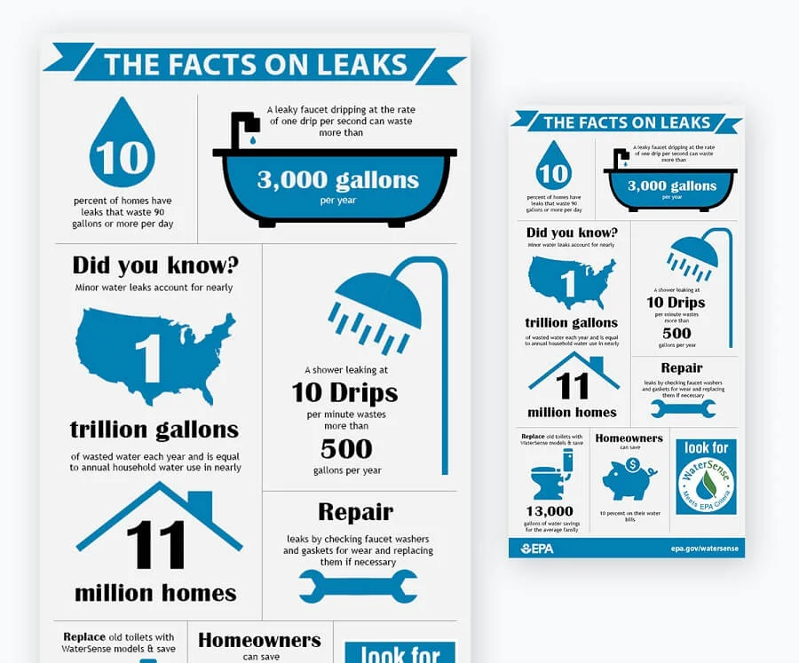
Example. The Environmental Protection Agency (EPA) uses infographics to educate the public.
What works well: The minimalistic design does not distract from the essence of the message.
Interactive infographics
Most often used in web design. Such infographics allow studying materials conveniently for the user: to linger on those blocks of particular interest.
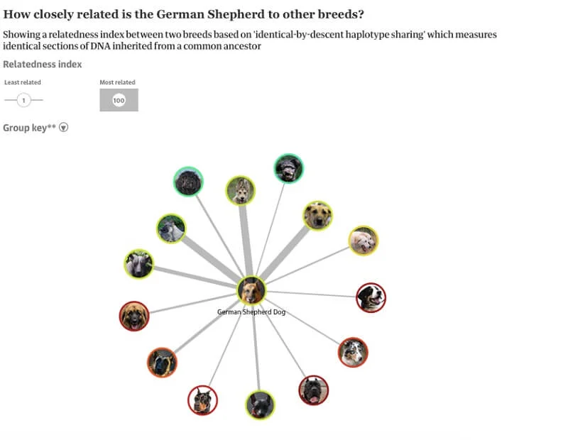
Example. The Guardian’s interactive infographic allows users to study the origins of dog breeds.
What works well: The reader can choose only the breed of particular interest.
Infographic test
Retains the user’s attention and increases viewing time. When creating something like this, be sure to think about adding real value, like in the example below - let’s solve some problems of the target audience.
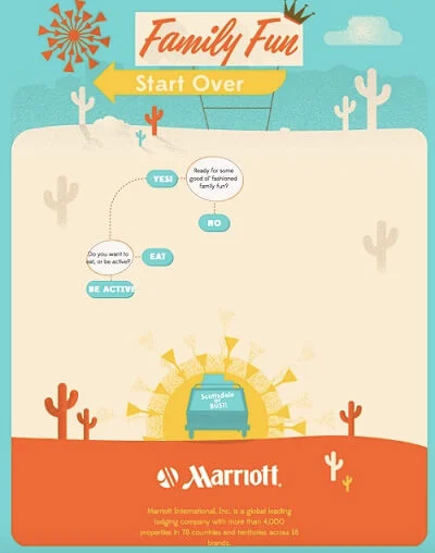
Example. Arizona Marriott Hotel Promotion Infographics, featuring a selection of local events in Scottsdale.
What works well: Retro style, intuitive design.
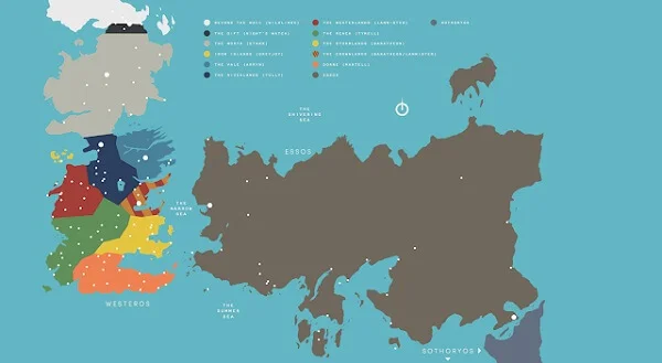
Infographics map
It is easier to know the way around and understand the manufacturers, countries, continents, and the structure of cities to illustrate the course of the board game. Infographic maps provide a wide variety of applications.
Example. A map based on the Game of Thrones series and books to navigate the lands of Westeros.
What works well: With the map, it is easy to imagine the events occurring in this world.
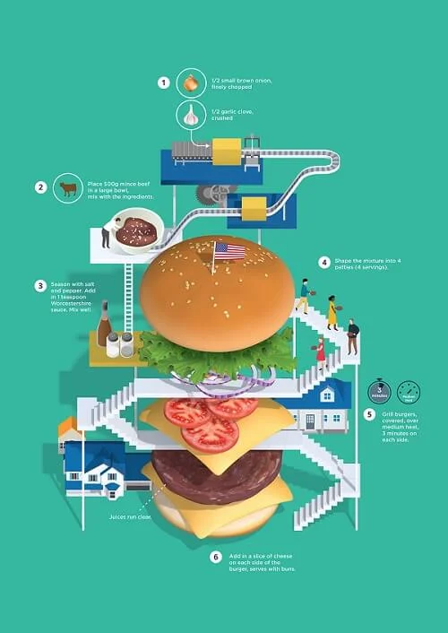
Recipe infographics
Food manufacturers, food bloggers, and culinary schools use such infographics with recipes very often. More broadly, bloggers can share their favorite recipes, and brands can share breakfast selections on Saturdays.
Example. Look at the creativity of Jing Zhang’s illustrations for recipes.
What works well: Highlighting a vivid visual image.
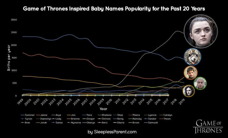
Chronological infographics
The most common type of infographics is a timeline, on which it is easy to reflect trends and historical events. Brands often use it to communicate the stages of a company’s development.
Example. The graph clearly shows how many children have been named after Game of Thrones characters over the past 20 years.
What works well: A non-trivial theme and “air” in design and typography.
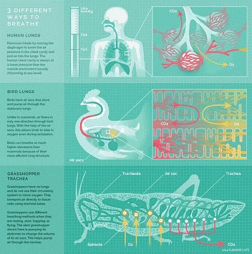
GIF
Videos get much more outreach than photos - this is already a given. That’s how Facebook’s algorithms work. There will definitely be videos among the first five posts that a person sees when visiting a page. And such infographics will solve the problem of being among them.
Example: Three different types of respiration — human lungs, bird lungs, and insect lungs are depicted.
What works well: The visual content explains everything - no text required.
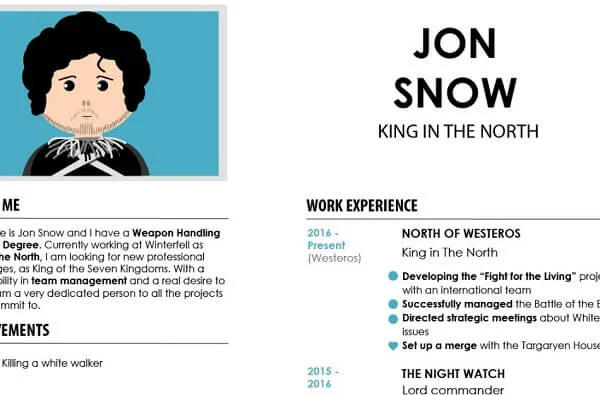
Infographics CV
You can use this format not only for its intended purpose as a CV when applying for a position but also in a humorous form. The main thing is to do it keeping to the existing Tone of voice brand or blog.
Example. Jon Snow is the hero of the Game of Thrones universe. There is a definite career breakthrough. He was a night watch, and a year later, he became the King of the North.
What works well: Readable font, restrained colors, the idea is easy to read.
10 tips for creating infographics
1. Don’t be afraid to create infographics without a designer
There are enough tools for working on infographics. If it is not possible to involve an illustrator in the development, use templates. Google chart tools are suitable for charts and charts, Infogram and Canva are perfect for interactive content.
The services help to assemble infographics without experience using ready-made templates developed by designers. There is no need to invent something new: take the basis and enter your data.

Free features to create landing pages — create a page that will be selling. Create a landing page in 3 minutes and start selling.
2. Prioritize visuals
A person remembers 20% of what they read and 80% of what they see, says Mark Tigelaar in his book ′′ How to Read, Remember and Never Forget”. Therefore, when working on infographics, the emphasis should be on the visual image.
Take into account the context - for which segment of the target audience the infographics are created, what will be the structure that will bring all the elements into a single one, what conclusion or what action the user should make after seeing the post on social networks.
3. Write and shorten
The purpose of infographics is to tell a story in an alternative storytelling format: no text. The text is read sequentially, and linearly the visual image conveys information in several dimensions - color, shadows, perspective.
Adapt all textual explanations: add symbols, break long text into short sentences, or better - cut it as much as possible. Strive for conciseness and succinctness.
4. Do fact check
Use journalistic tools. Work with the results of Levada Center, FOM, Rosstat research data. Run short interviews with experts on the topic to find unique insights.
To increase the credibility of the data presented, refer to sources. For example, you can indicate at the bottom of the infographic “according to Rosstat data” and provide a link to this study.
5. Analyze as many good examples as possible
Visual experience works here as well. The more infographics you see, the faster you find solutions for your projects: you analyze what was done well and what could be improved.
You can find interesting examples on Behance, where designers post portfolios. Let’s say, Cisca’s Time Capsule is a type of infographics illustrating the development of design technology through inventions of the 1950s, 1960s, and 1970s.
6. Take care of the reader
Check how the finished infographics look on different devices: texts, pictures, interactive elements should look equally good in the desktop and mobile versions.
An important point — take care of the eyesight of subscribers. It is best not to use more than three colors and fonts. Otherwise, it can disturb the perception of the main idea — do not overdo it with nuclear shades and creative fonts.
7. Add promo
Provide a source — a link to a blog, a USP of a company, a logo. Why? To get additional points of touch with the user if the infographic goes viral and gets high reach.
Often, there are sad cases when large media or bloggers share infographics, the authorship of which is not clear. Therefore, use all available promo options, and don’t forget about this when developing the terms of reference.
8. Follow the rule: one piece of infographics per one idea
There are infographics ideally designed from a visual point of view but completely empty in content. It’s like be overdressed: you get an inappropriate image in which you feel uncomfortable.
Infographics always convey only one idea. If you are talking about wines that go well with fish, there is no need to tell about the producing regions and the glasses for serving them.
9. Experiment with formats
The audience of all brands, bloggers, influencers, media is different, and one of the main tasks is to learn how to work in your niche and with your target audience. It’s easy to figure out what infographics get good reach: look at the numbers in 2-3 weeks.
Perhaps infographics as a content unit will not be suitable for solving your problems in your field. That is also an excellent conclusion that can be drawn by analyzing the statistics after publication.
10. Study books and materials about visual thinking
We recommend starting with David McCandless’s visual guide — “Information is beautiful” and tips to market your ideas with simple visuals from Dan Roam’s “The Back of The Napkin. Solving Problems and Selling Ideas with Pictures”.
Ideas for work — Mike Rhodey “Visual Notes.” Dozens of techniques from infographic experts (designers, artists) in Beautiful Visualization: Looking at Data through the Eyes of Experts by Julie Steele, Noah Iliinsky.