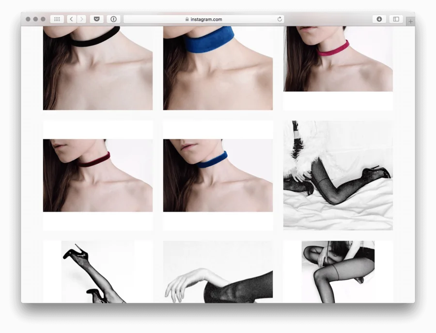
Typically, online stores tend to have high-quality, dynamic photos representing their wares. Pictures posted on Instagram can sometimes be monotonous and uninspired by contrast. It’s possible for users to remedy this issue with two of our favorite hacks: using geometric compositions with a perspective from above and shooting down toward the forehead. You often see this method in your newsfeed.
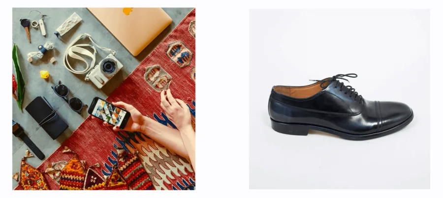
These are beautiful photos. However, if you only publish pictures like this, your profile will be boring and uninviting. Let’s examine some simple ways of diversifying the composition of your pictures.
1. Shoot close-range at a 45° angle
Think about the way a person examines an object when he or she wishes to get a better look; they bend down to see it more closely.
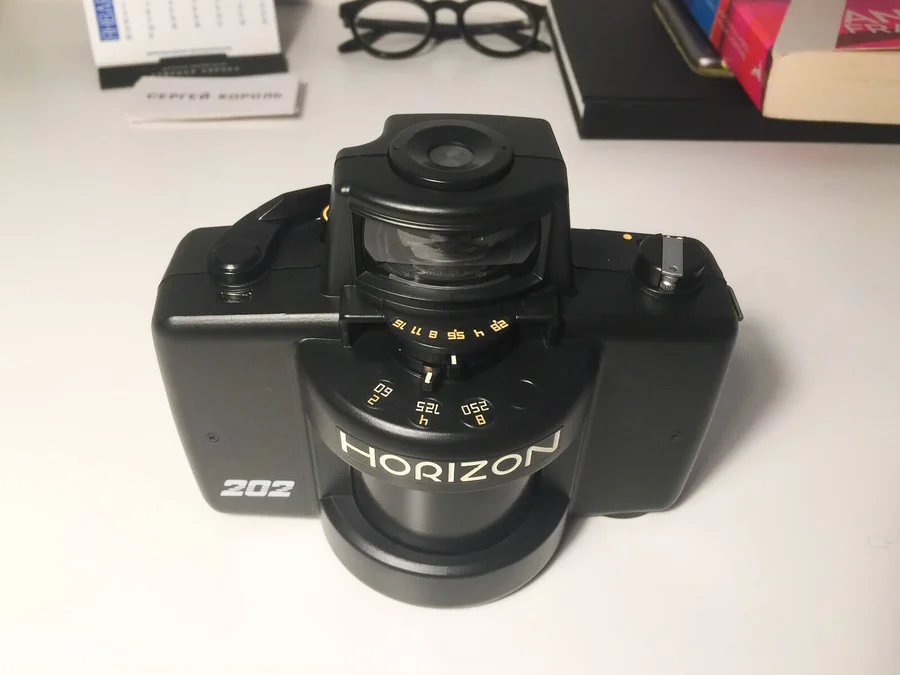
Keep in mind that shooting a picture this way fills the frame with the object, but it may be slightly distorted, and look large and bulky. Practice by taking pictures of smaller objects, such as jewelry, shoes, or electronics until you get it right.
2. Distribute the objects evenly across the frame
If there are several objects in the picture, try to center them. This method is based on the principle of intimacy in which objects positioned near one another seem to be related to each other.
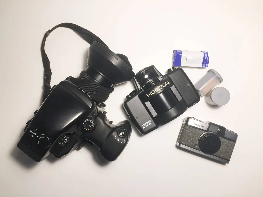
If you just want to focus on a specific object, expand the composition by moving all the decorative objects around to the edges of the frame. If they are cropped, it will signify their insignificance.
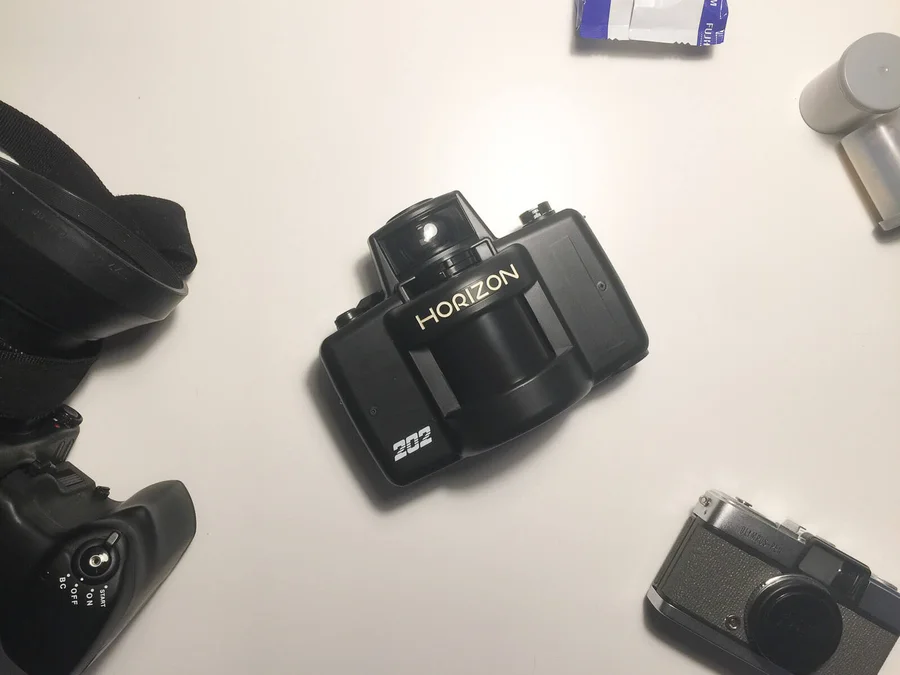
3. Use an S-shaped curve
Often, objects are aligned linearly or in a grid. It looks uninteresting:
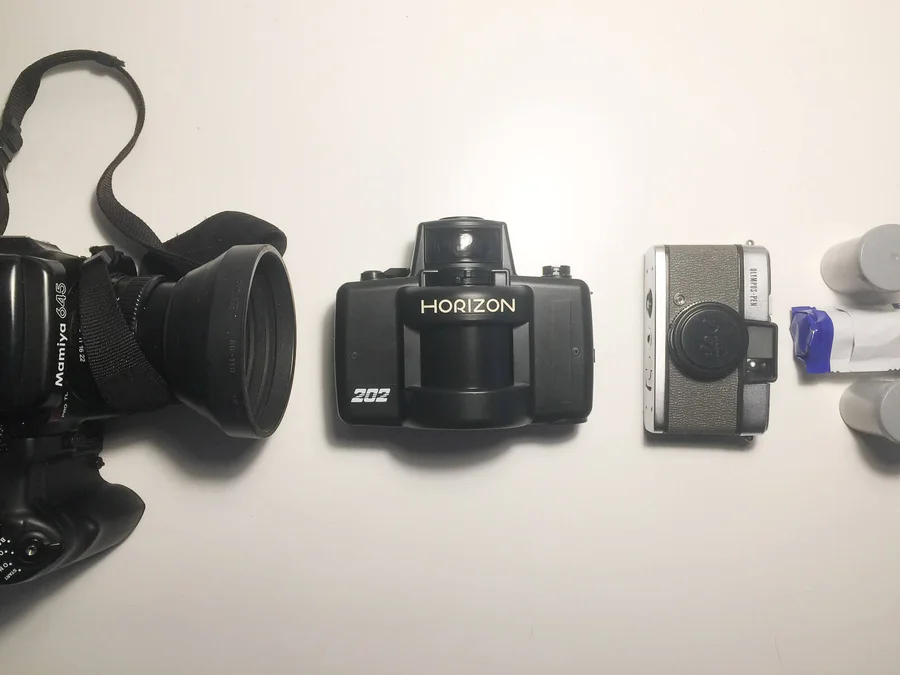
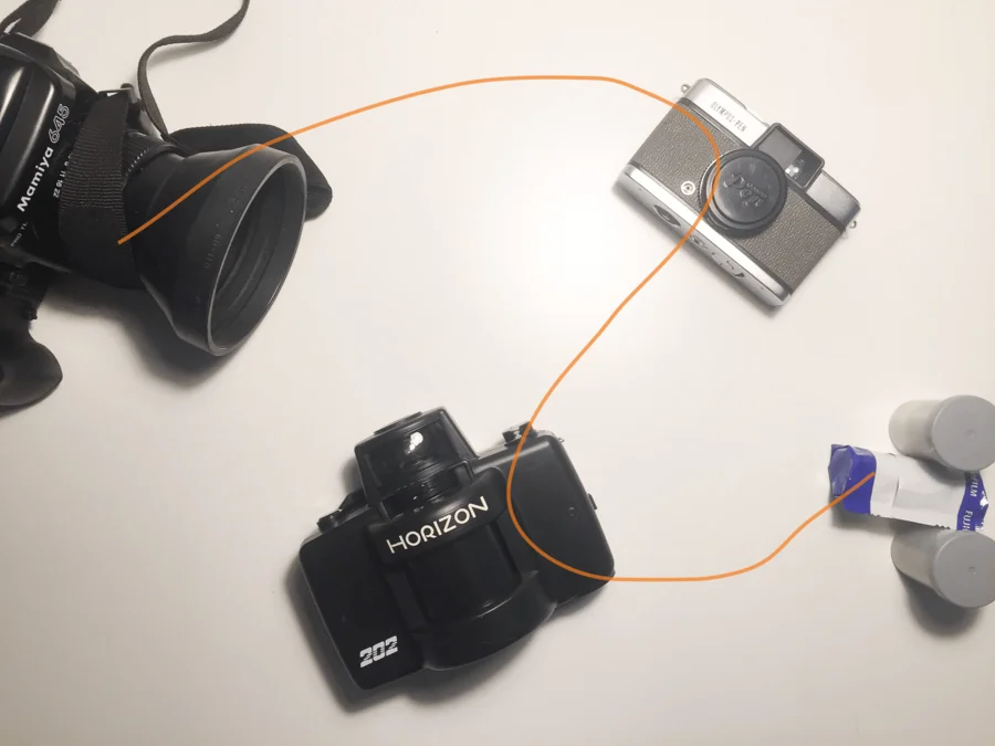
To add diversity to the composition, place items along an S-shaped curve. This shape resembles the natural movement of the eye as it scans a picture. Moreover, the S-shaped composition looks more real, not artificial.
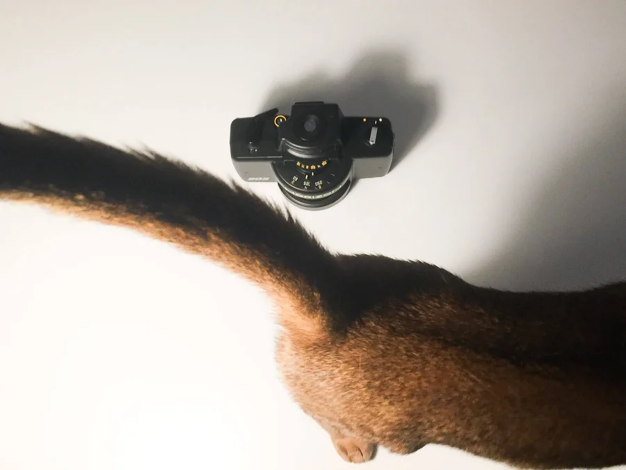
Finally, you are ready to add any small, but important details.
Some examples
Let’s take a look at some accounts with both good and unusual submissions:
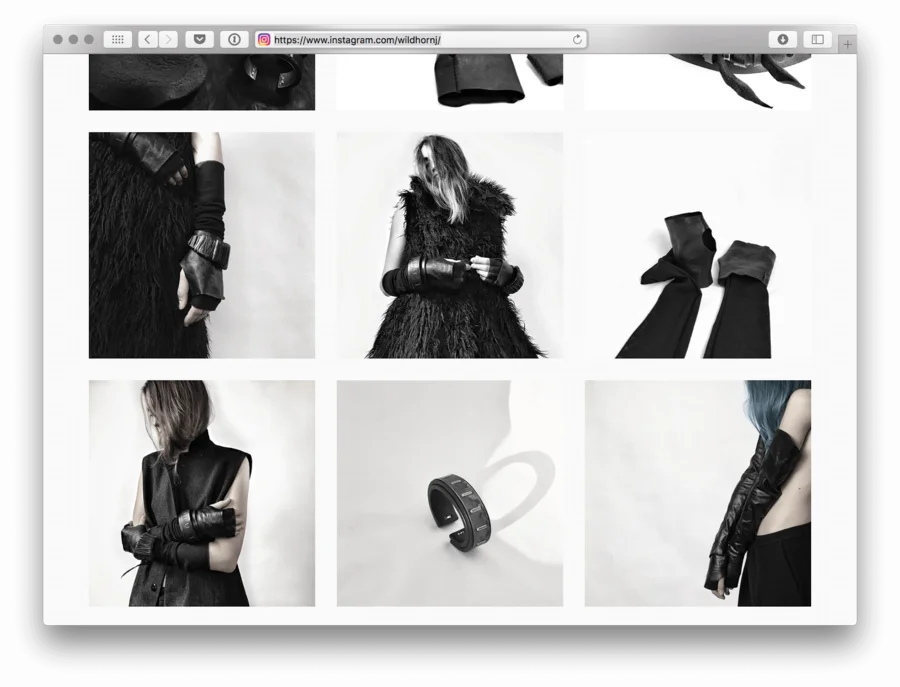
The decoration and accessory store @wilddhornj uses photos of models with white backgrounds. Company Account Acceptance: Bottom Images.
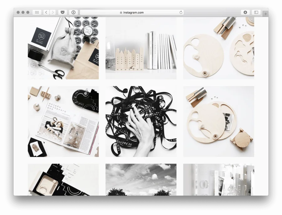
The designer toy store @52factory masterfully shot everything from above. Note the nonlinear composition and the clarity of the frame.
The designer @yuliachulkova combines black and white images with colored ones. The model in the color images always holds the same pose and looks exactly the same; only the product modeled changes from image to image.
