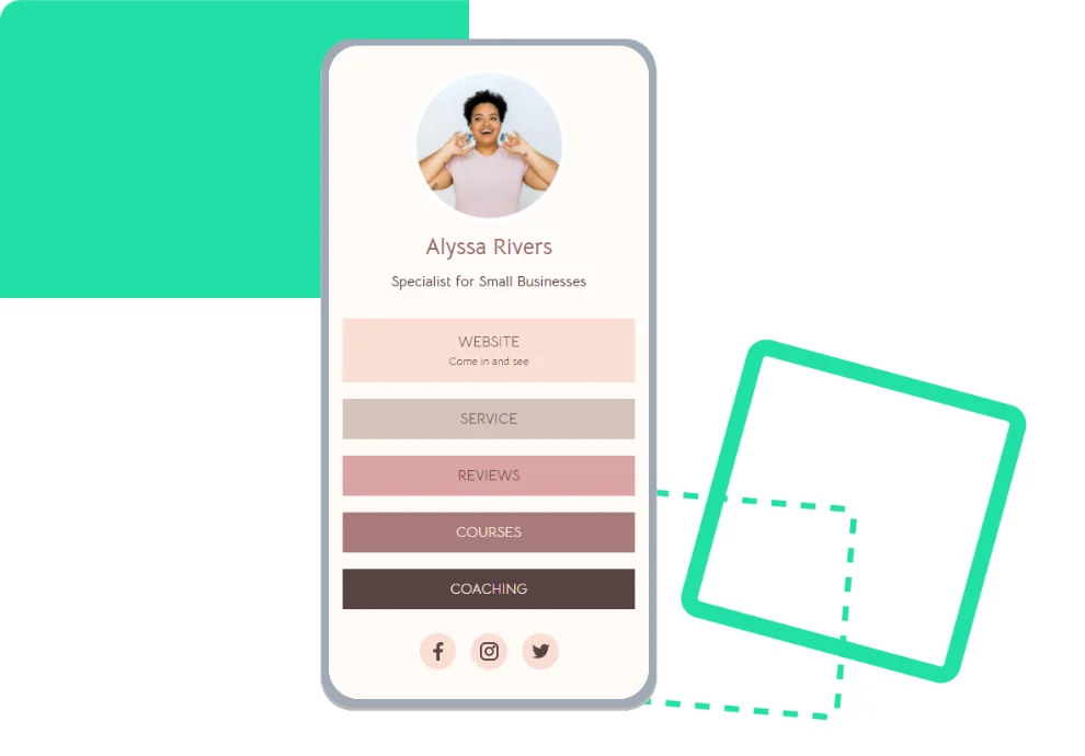
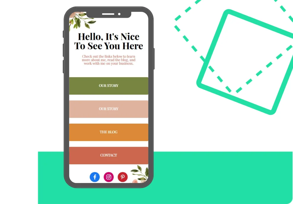
Builder by Onlypult will let you create your own simple website without employing a team of developers. This option will be helpful for entrepreneurs that want to test hypotheses and to receive and analyze results as quickly as possible.
Onlypult has the following blocks: page layout, visual style, and settings. We will tell you about the tools making your page visually attractive.
Choose the required fonts
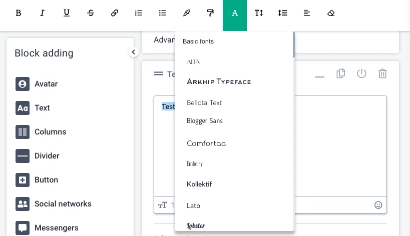
To choose the right fonts, try to stick to the same style for all the blocks and make it relevant to the aim of your micro landing page.
Experiment with different font styles. For example, use one style for the core headline and another for the body text.
Experiment with different weights. For example, use a heavier weight for the core headline and a lighter one for the body text.
Add a divider
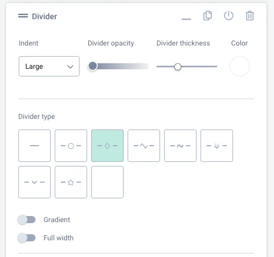
Visual highlights are crucial. They help users to follow the chosen structure: they will notice different sections of your website.
Try out different options and color solutions. Follow your brand style or introduce a new one for your micro landing page.
Use gradients and add a divider for the entire width of the page.
Choose a background color
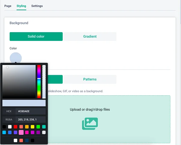
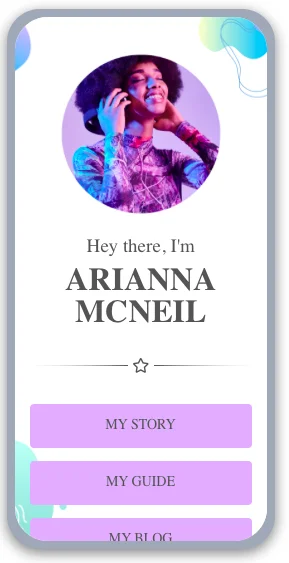
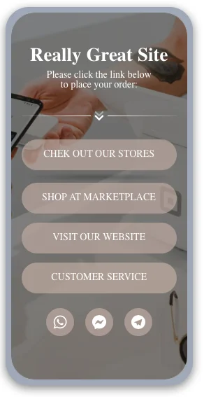
The color scheme affects the conversion rate. Color should be in line with the colors of your website and reflect the brand message or the theme of the product or service.
Users tend to associate colors with certain feelings and emotions. Designers know that and use hues in line with the rules of color psychology.
For example, red enhances a sense of hunger. Look at the branding of fast-food chains. Blue gives you a feeling of safety, which is why you can often see it on the websites of medical organizations.
Choose button colors
Each button is a call to action, which is one of the web design fundamental elements. Visually mundane buttons are easy to skip.
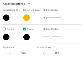
By trying out various settings on Onlypult, you can choose the required variant that will facilitate your marketing goals and add to the visual identity of your website.
Add bright elements
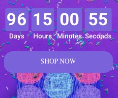
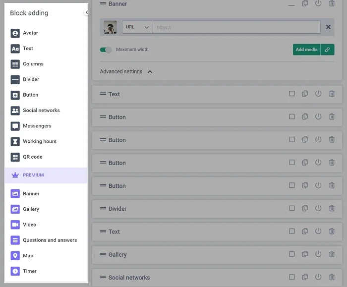
Add a timer if your offer for a service or product has a limit. Include a poll and a map. Provide links and QR codes for social media platforms.
Conversion landing pages follow a distinct structure. The first block has a visual element: a photo, an illustration, a video, and a headline with a succinct USP followed by a call to action that attracts attention.
The content block might have elements for building trust — cases, feedback, and detailed information about products and services. It can also contain video tutorials if you want to show how the platform works and what users will experience after the purchase.
You can find all elements of a landing page on your Onlypult account.
On your Onlypult Builder account, you can choose a suitable template for your landing pages — if it is for a personal or brand page, sales, or any other marketing objectives.
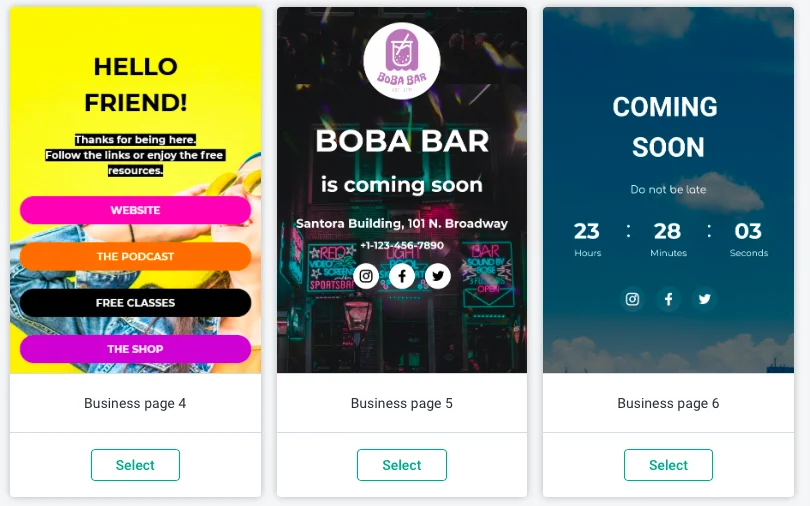
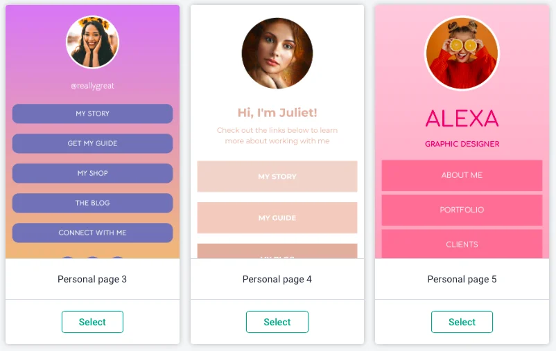
Take a suitable template and create micro landing pages from scratch with the help of our Builder. Do target audience research, sell products and services, and create portfolios.
