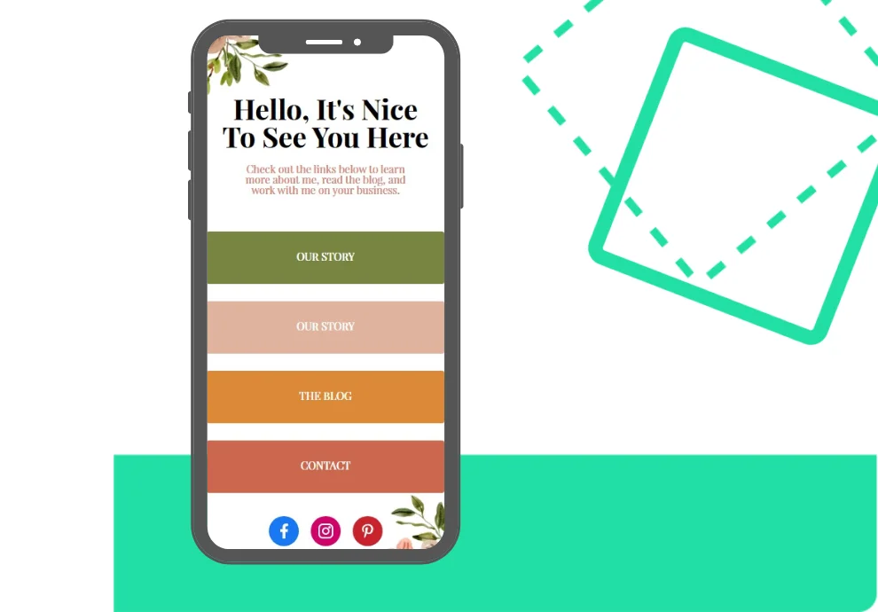
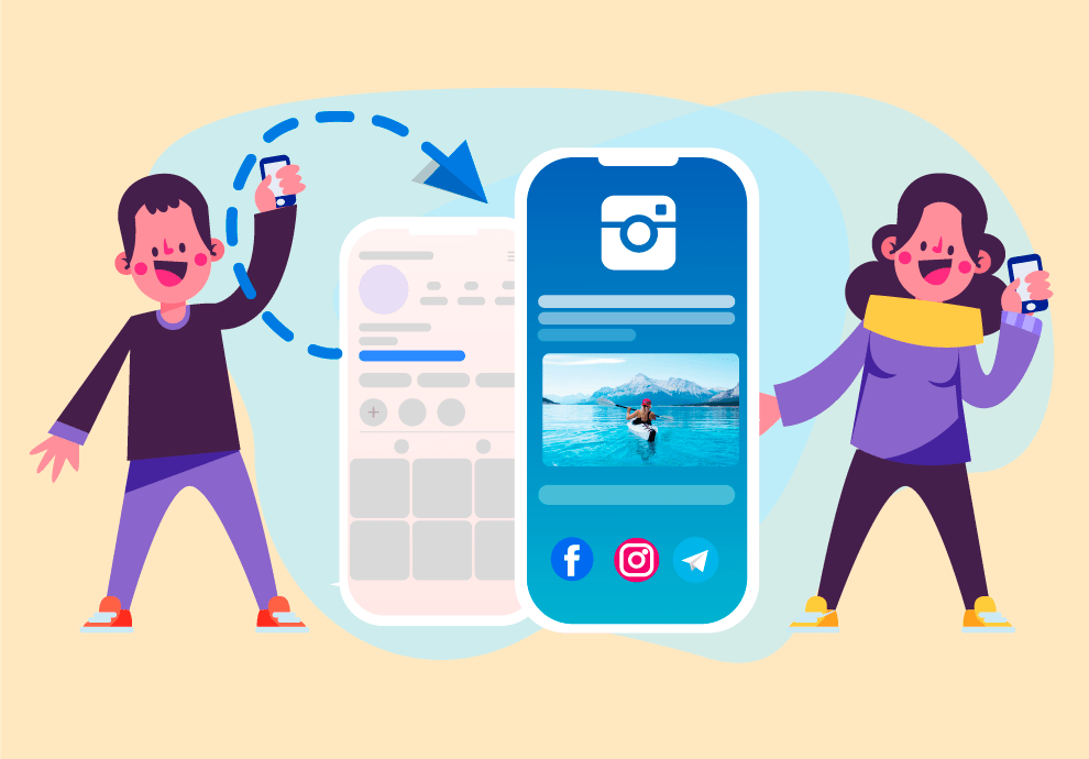
A mini landing page is a website with a heading, titles, descriptions, payment or subscription buttons, and links to messengers. Let us tell you what mini landing page options you have and how to make such a page without the help of a web designer.
Info website
It is a web page telling people about your company on the whole or your product — in particular. Mini landing pages of this type will carry the most information possible.
Here you’ll get the following sections: Our mission, Our team, Our services, and Our contact info. The core purpose of this type of landing page is to provide a complete idea of a company and its products to the visitor.
You need to pay attention to the structure of such a page: all the navigation should be user-friendly. You might use your brand style and visual effects. Give your visitors complete contact information so they can reach you easily.
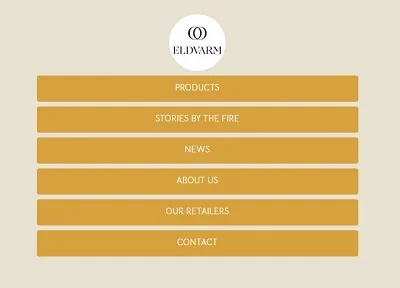
Mini landing for conversion
Such a mini landing page helps your would-be clients to do what you want them to do, for example, to click on the Call me back button, ask a question, or compare the products chosen.
Attractive buttons and promotional features (such as a countdown timer for a time-limited offer) are standard for such micro landing pages.
It is necessary to consider every call-to-action button. The wording should correspond to a specific marketing goal and be attractive to the target audience for which this mini landing page is created.
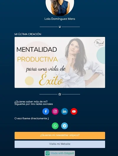
Subscription page
It is a page to collect e-mails from your users — quite an easy way to get subscriptions.
A subscription page shall be short and shall contain a subscription form. You need to give exact information on what your visitor subscribes to, what kind of information you’ll be sending them, how often will your e-mails reach them.
It is good practice to give some benefits for subscribing — like a free product, a half-an-hour personal session, and info materials such as books, guides, and checklists.
Audience Study Page
Once you’re up to CustDev and collecting insights from your users, you’ll need to study various target audiences.
Audience study pages are like questionnaires: a series of questions with open replies. Don’t overload your users with questions — up to 15 questions are more than enough.
Encourage your users to fill in your questionnaires — use gifts or discount coupons for participation — that way, you will be able to gather and analyze the data faster.
A micro landing page that sells
It is a customary landing page containing info on products or services with click-to-pay options right at hand.
The micro landing page has a mobile version, aims at telling about the product or services, encourages visitors to buy it, and provides an easy way of payment.
Check whether your micro landing page can sell on various devices — whether all the wordings are visible, it is clear how to pay, and payment methods work.
How to make a micro landing page yourself
1. Choose a specific micro landing page
There is a rule: create a separate micro landing page for every goal. Do not waste your users’ attention. The content of a landing page should correspond to your ultimate purpose for this specific landing page.
2. Elaborate on the structure
Make a simple and easy-to-understand interface, as user-friendly navigation shall keep your visitors’ attention for a longer period — and therefore, your conversion rate will increase.
3. Choose the page builder
Onlypult allows you to make micro landing pages without any background knowledge of software engineering. You can choose the blocks you need and add content. The preview option will help you improve your general design.
Create micro landing pages and follow the results. Onlypult will give you analytics of any kind: views, unique visitors, locations, link clicks, and types of mobile devices.
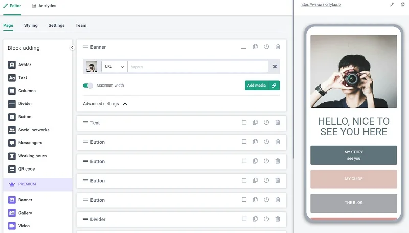
You can add Google Analytics and Yandex. Metrika, Facebook, LinkedIn, Pinterest, and TikTok tracking pixels.
